
Notifications
Overview
Definition
Notifications are messages that tell a customer (or user) system-based or relative information.
We have several variations
- Informational
- Success
- Warning
- Error
in two sizes
- mobile
- desktop
Guidelines
Notifications should be used to help people understand the context around their actions. This could be to let people know they completed a task, help fix an issue, or provide information to upcoming changes.
These should be used sparingly since too many can cause people to ignore them. We don’t want to induce banner blindness.
Variations

| Variant | Purpose |
|---|---|
| Informational | These can be used when ALEX needs to inform people of information that may not be related to the current task. |
| Success | When a task has been completed as expected. |
| Warning | These tell people that there may be unexpected or undesirable results if they continue. |
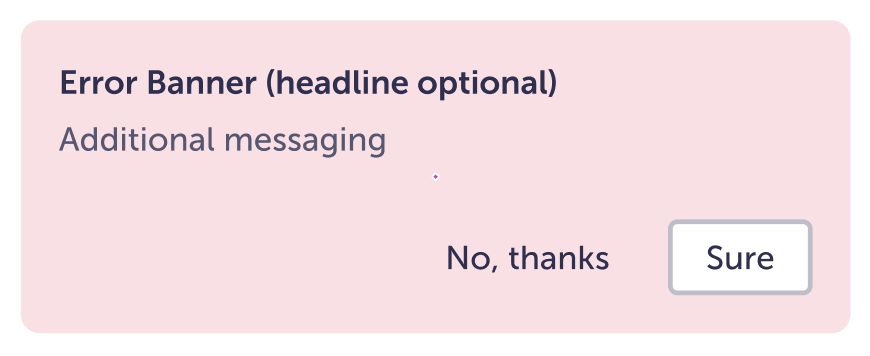
| Error | There are certain actions that will need to be addressed before a customer / user can continue. |
Content
- Be brief and descriptive, but do not use technical jargon for a general audience.
- Let people know of any actions they can take to fix the issue.
- Use the headline if extra context is needed, e.g. you want to emphasize something about the message.
Visual
Action options
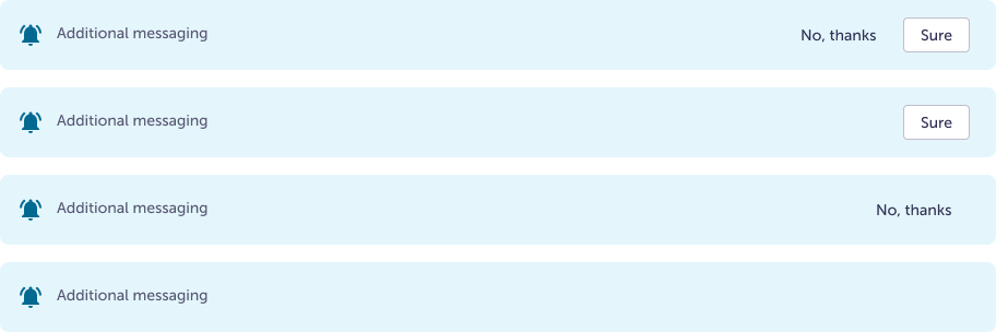
- Without buttons
If the message should not be dismissible - One button
A single action, most commonly used to clear the message. Either the Secondary or Tertiary button option is available. Try using the Tertiary since it has less visual noise and the action is not very important. - Two buttons
If there are multiple actions someone can take use a Secondary and a Tertiary button, with secondary being the more important action
Headline
- Can be hidden if additional context is not needed
With headline (most visual noise to least)
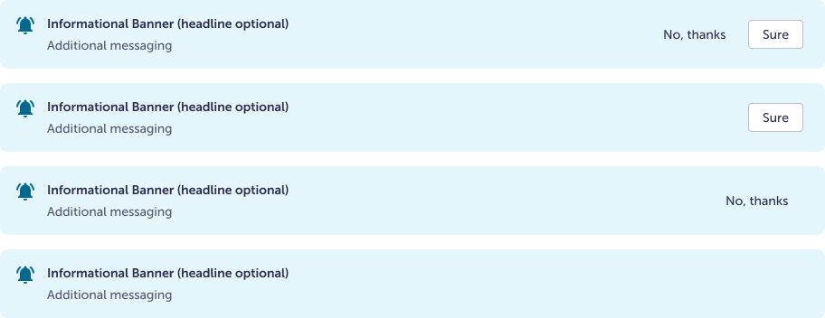
Without headline (most visual noise to least)
Don’t
Don’t remove the icons. Icons should stay visible because color should not be the only indicator of the notification type.
Specs
The border radius, icon size, type sizes, and buttons stay consistent between the different notification types. Only the background and icon colors change between variants.
Variation specific
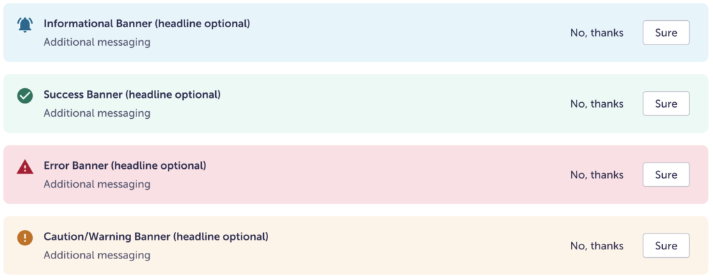
| Type | Background color | Icon color |
|---|---|---|
| Informational | $blue-100 | $blue-800 |
| Success | $green-100 | $green-800 |
| Error | $red-100 | $red-600 |
| Warning | $orange-100 | $orange-600 |
Consistent between all
| Height | Fluid, depends on how much text there is and if the headline is visible |
| Border radius | 8 px |
| Icon size | 24 px |
| Icon alignment | Top left |
| Icon spacing | 12 px |
| Headline size | header-paragraph-small |
| Headline spacing | 4 px |
| Body copy size | body-small-500 |
| Buttons | Small secondary and / or tertiary (link out to Button page) |
| Button spacing | 8 px |
Desktop

| Padding | 16px 24px 16px 16px |
| Min-width | 576px, anything smaller should be Mobile |
| Max-width | Container size |
Mobile

| Padding | 16 px (1 rem) |
| Max-width | 575px, anything larger should be full-width |
Accessibility
- Color should not be the only way to represent variation. That’s why all versions have the icon in addition to the message.
- While the backgrounds do not pass AA standard on a white or light background; the icons, text, and buttons do pass.
- Keyboard accessible.