Links
Overview
Definition
Links are used to navigate to a different place. This could be a new page, a different spot on the same page, or to a downloadable resource.
We have three types:
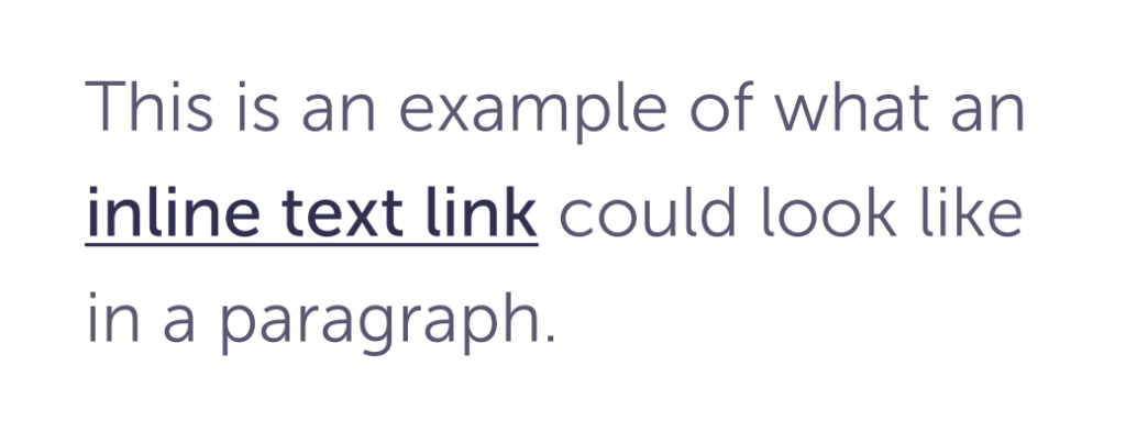
Inline
used within body copy, usually in a paragraph

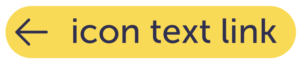
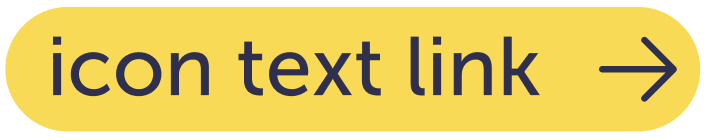
Standalone
used in cards, on their own in a page


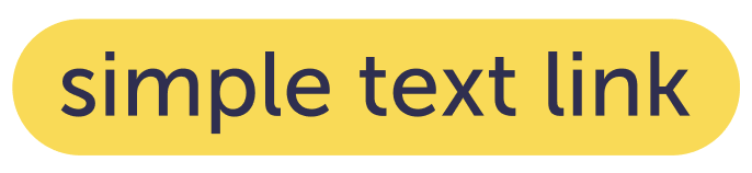
Simple
most commonly used in the footer or main menu

Similar or related Components
- Buttons
- Menu (coming soon)
Guidelines
While links can be confused with buttons (especially when a link looks like a button), they have different functions. Buttons keep you within the same product, links navigate elsewhere.
Content
- Use distinctive and meaningful link text.
- Ensure that links reflect the info users will find at the destination.
- Try not to use the generic phrase “read more.” Make them unique, it helps people using assistive technology understand where they are and where they can go.
- Avoid using the same text for different destinations on the same page. Try to differentiate between links by using unique text for each.
- Ensure links are understandable and not excessively long, especially if they wrap.
Interaction
- Links should open in a new tab, in case the user wants to reference information from the product that they were using.
- It’s best to use them sparingly, and for sending people to external sites.
Visuals
- Don’t use Simple links in paragraphs. For accessibility, links need to have at least one visual distinction (besides just color).
- Don’t use Standalone links in paragraphs. The icon and spacing will cause lines of text to have uneven proportions and disrupt the reading experience.
- Don’t use icons next to links within body paragraphs. It will create gaps in the lines.
Do
You can change the color of the inline link to reflect the body copy better.
Say you’re using a lighter color for a specific piece of content, and you want the link to hold less visual weight.
Don’t
Don’t change the color of the simple hover.
You can change the default type color for appropriate contrast on different backgrounds, but the hover state should stay the same.

Specs
Inline


| Default | Hover | Disabled | |
| Type size | Match the paragraph it’s in | ||
| Type color | $ink-600 | $blue-800 | $ink-400 |
| Decoration color | $ink-600 | $blue-800 | $ink-400 |
| Decoration height | 1 px | ||
Standalone


| Default | Hover | Disabled | |
| Type size | variable | ||
| Type color | $ink-800 | $ink-400 | |
| Icon spacing | 8 px | ||
| Background color | $yellow-400 | $ink-100 | |
| Icon color | $ink-800 | $ink-400 | |
| Icon size | 20 px | ||
| Border radius | 50% | ||
| Icon padding | 2 px | ||
Simple

| Default | Hover | Disabled | |
| Type size | variable | ||
| Type color | $ink-800 | $ink-400 | |
| Padding | 8 px 0 px | ||
| Background color | – | $yellow-400 | – |
| Border radius | – | 50% | – |
Accessibility
Make sure they are labeled correctly in the code for screenreaders and assistive technology to know what they are.