Accordions
Overview
Definition
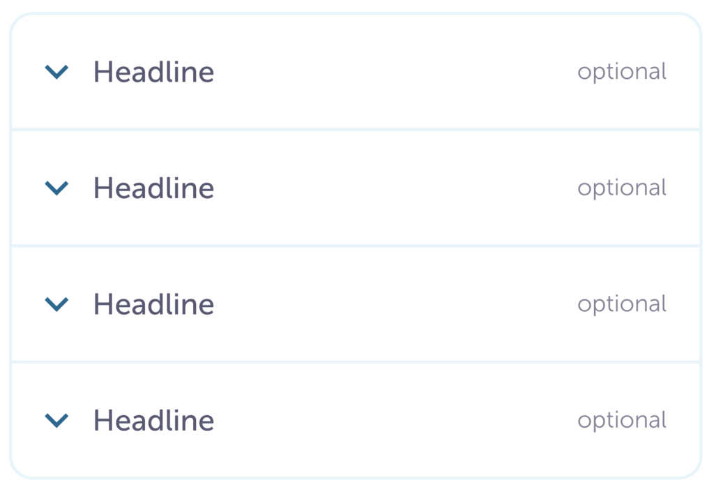
A vertically stacked list of interactive headers that open or close related pieces of information.
There are three different types of accordions:
1. Simple
Most commonly used in side menus or filters and when space is at a premium
2. Small
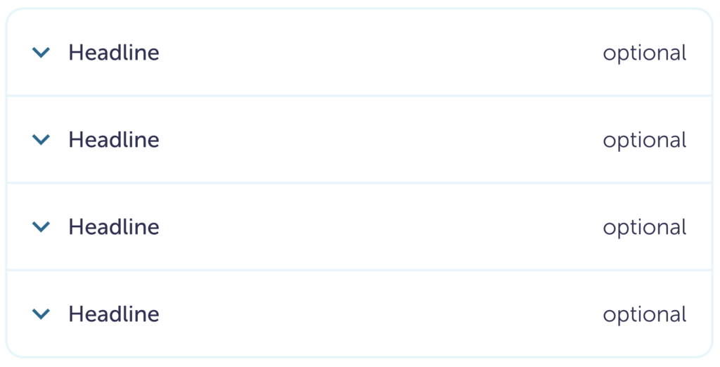
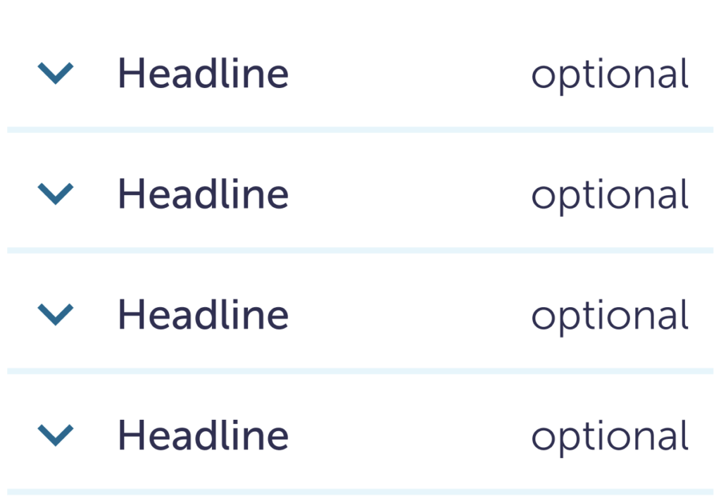
Similar to Simple, and has an option to include an extra detail in the headline
3. Large
Commonly used for FAQs and when we have more space on the page.
Similar or related Components
- Expand view
- Side sheet (coming soon)
Guidelines
These are used when there is a need to explain additional information without overwhelming people. By using progressive disclosure, accordions allow someone to get a general idea of the available options through brief headlines.
They can be used when the page length needs to be shorter. Since information is hidden, it should be used for supplementary information.
If any of the information in the accordion dropdown needs to be read, keep it with the main body copy.
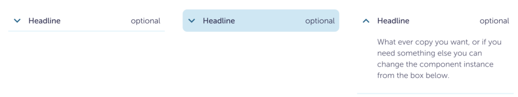
Simple has the least visual noise, it should be used when it’s obvious there are interactive elements. This could be for grouping filters under a single section.
Icon right
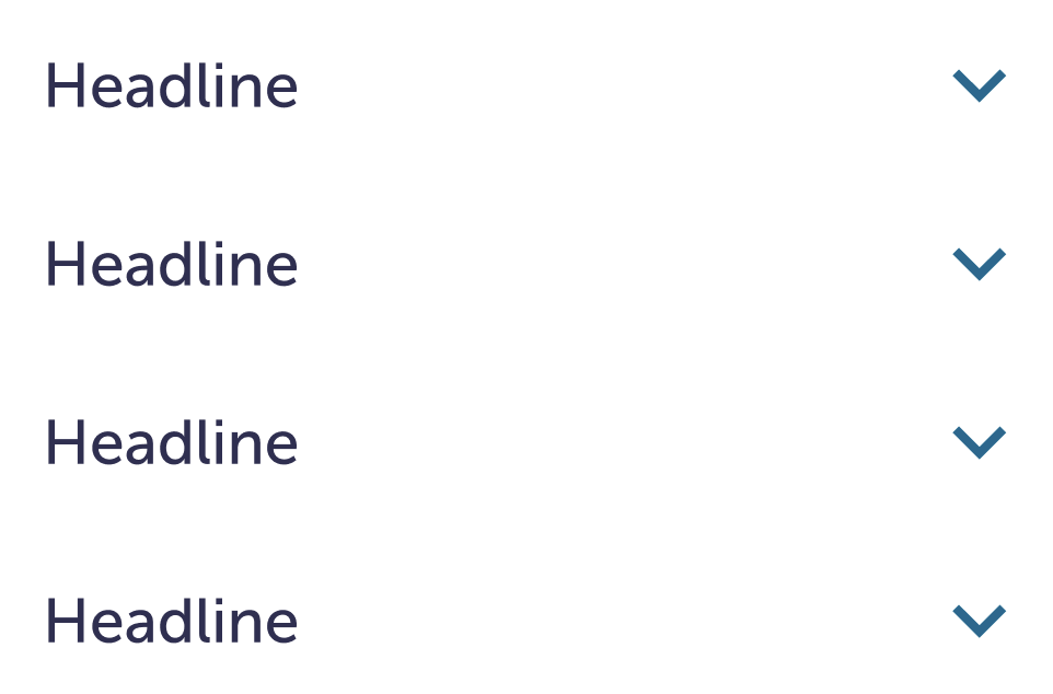
Icon left

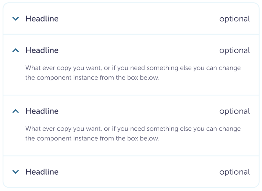
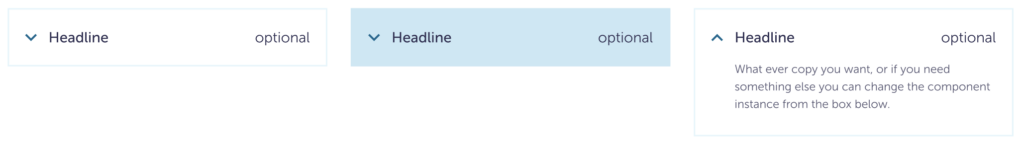
Small and Large have more visual noise. They are meant to draw more attention to themselves. The additional header text is for supplementary information. One example: a monetary figure. Then the calculation details can live in the dropdown.
Small
Large
Content
Do
Keep headlines short and concise.
Caution
Don’t let the accordion body copy get too long. It can cause people to lose track of their placement in the page.
Don’t
Don’t hide important information in the accordion body copy.
Visuals
Do
Have more than one accordion in a list. If you don’t, Expand View may be better.
Do
Someone can open more than one accordion at a time.
Caution
It’s okay to change the size and color of the text, just make sure they reach the appropriate contrast.
Don’t
Don’t change the icon color.
Don’t
Don’t change the icon.
Don’t
Don’t nest accordions within accordions.

Specs
Simple

| Closed | Hover | Open | |
| Padding | 8 8 8 4 | Right 4 | |
| Background color | $white | $blue-200 | $white |
| Border radius | 0 | 8 px | 0 |
| Icon size | 24 px | ||
| Icon fill color | $blue-800 | ||
| Icon padding right or left (depends on the style) | 24 px | ||
| Header size | body-small-500 | ||
| Header color | $ink-800 | ||
| Body copy size | n/a | n/a | body-small-300 |
| Body copy color | n/a | n/a | $ink-600 |
Small
| Closed | Hover | Open | |
| Padding | 4 8 8 8 | Left 32 | |
| Background color | $white | $blue-200 | $white |
| Border radius | 0 | 8 px | 0 |
| Border color | $blue-100 | n/a | $blue-100 |
| Border bottom size | 2 px | 0 | 2 px |
| Icon size | 24 px | ||
| Icon fill color | $blue-800 | ||
| Icon padding-right | 8 px | ||
| Header size | body-small-500 | ||
| Header color | $ink-800 | ||
| Optional header size | body-small-300 | ||
| Optional header color | $ink-800 (can change) | ||
| Optional header spacing | 24 px | ||
| Body copy size | n/a | n/a | body-small-300 |
| Body copy color | n/a | n/a | $ink-600 |
Large
With the styling of the large size, the border radius changes if it’s the top, bottom, or in the middle.
| Top | Middle | Bottom & Footer | |
| Border radius | border-radius-lg border-radius-lg 0 0 | 0 | 0 0 border-radius-lg border-radius-lg |
The rest of the details remain the same between all placements.
| Closed | Hover | Open | |
| Padding | spacing-04 spacing-05 spacing-05 spacing-05 | Left 40 | |
| Background color | $white | $blue-200 | $white |
| Border color | $blue-100 | $blue-200 | $blue-100 |
| Border size | border-width-md | ||
| Icon size | 32 px | ||
| Icon fill color | blue-800 | ||
| Icon padding-right | spacing-04 | ||
| Header size | body-large-500 | ||
| Header color | $ink-800 | ||
| Optional header size | body-large-300 | ||
| Optional header color | $ink-800 (can change) | ||
| Optional header padding-left | spacing-05 | ||
| Body copy size | n/a | n/a | body-medium-300 |
| Body copy color | n/a | n/a | $ink-600 |
Accessibility
- Colors pass AA WCAG contrast, except for the underline. Since those are not the important part, it’s okay they don’t have the same contrast.
- Can use with keyboard and assistive technology.