Buttons
Overview
Definition
Buttons are triggers for events or actions within the UI. Button labels express what action should occur when the user interacts with it.
We have several variations:
In a few options:
- Medium
- Small
- Text only
- With icon
- Only icon
Similar or related Components
- Link
- Menu (coming soon)
Guidelines
Buttons are most commonly used to trigger an action, or event, on the same page.
While buttons can be confused with links (especially when you’re on a form and a button takes you to another screen—we know, it’s confusing). However, they have different functions. Links are for navigating to another product, or external URL.
Content
- Keep button copy consistent throughout ALEX to create platform-wide understanding.
- All buttons should be sentence case, capitalizing only the first letter of the first word. Proper nouns are the exception to this rule, whether external or platform-specific.
- Include articles like “the” and “a” for clarity, but otherwise try for brevity.
- Try not to extend to a second line. (This is sometimes unavoidable with responsive design).
Visuals
Hierarchy
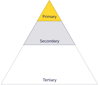
The diagram is only for illustrative purposes, it’s meant to give a general idea of how often the different types of buttons should be used on a page. Buttons don’t need to follow the exact naming convention, you can use Tertiary more frequently than its name suggests.
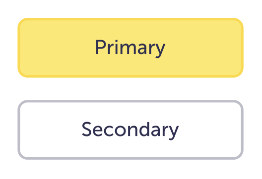
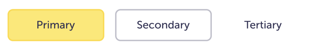
Primary
Should be used for the most important actions, and it should be used the least.
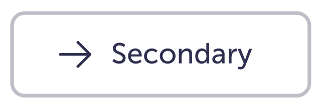
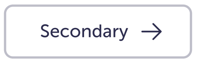
Secondary
Can be used more often since it doesn’t hold the same visual weight as the Primary, but they should rarely appear on their own.
Tertiary
Can be the most frequently used since it has the lowest visual weight.
Do
If you need to pair a button with a Primary.
Use a Secondary or Tertiary button—think about the preferred order of actions to help determine which style to use.
Do
Pair Secondary and Tertiary when actions aren’t as important as the Primary.

Do
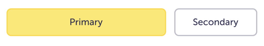
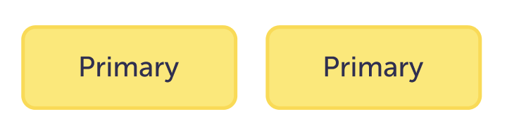
When buttons are paired side by side, try to make the buttons the same width whenever possible.
Do
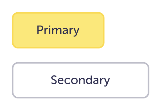
If buttons are stacked, they should all be the same width.
Don’t
Have many icon-only buttons on a screen.
Most icons don’t have the same meaning for everyone. If there is no label, it can create confusion over the intended action. When in doubt, use a label.
Don’t
Don’t change the colors of the buttons.
Don’t
Don’t stagger the ends of stacked buttons.
Don’t
When buttons are paired side by side, don’t make them drastically different widths.
Caution
Try not to use Disabled buttons.
It’s a better practice to let someone interact with the button and show them an error message with appropriate next steps. This way they can see what needs to be fixed, rather than be stuck and confused about why they can’t continue.
Caution
Try not to put more than two buttons side by side.
Depending on the screen width / container width you may end up with one under the other two.
Caution
Outside of interactive conversation moments, don’t pair Primary buttons.
This causes cognitive overload for users, since it’s not easy to understand the preferred action.
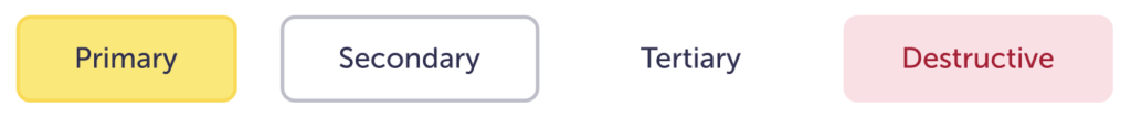
Variations
| Variant | Purpose |
|---|---|
| Primary | The main call-to-action (CTA) on the page. Ideally, Primary buttons should only appear once per screen. |
| Secondary | These are additional actions, and they are usually paired with another button. They can be independent when in specific components. |
| Tertiary | Tertiary buttons can be used in isolation or paired with another button type when there are multiple actions on a screen. |
| Destructive | For actions that could have negative effects on the user’s info or process (for example: delete or remove). |
Sizes
Medium
Used as the main size for most screens throughout ALEX. The height is calculated to add up to 48px with the size of the font and icon. This is to allow for a larger interaction area.
These are meant for most BC / Go buttons. They are the same height and type style as most form fields.
Small
Used when vertical space is at a premium. These are more common within a component. The height adds up to 32px, it’s still a reasonable size for many people to interact with, but not the ideal.
Icons
Left and right icon
When there’s a need for extra visual support within the button
Icon-only
Should be used sparingly. For example: video controls, tooltips, etc.
When in doubt, add supporting text.
Specs
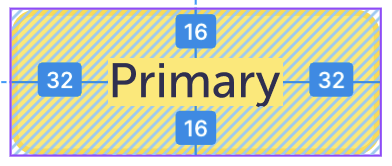
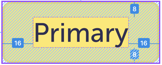
Colors stay the same for the variants between sizes. It’s the border width, border radius, type size, icon size, and padding that will change between medium and small.
Medium

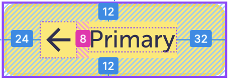
These are consistent between variants.
| Px / pt | Rem | Name | |
| Border radius | 8 | 0.25 | border-radius-xs |
| Border width | 2 | 0.125 | border-width-md |
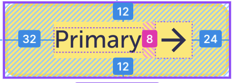
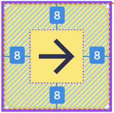
| Padding: text only | 16 32 | 1 2 | Spacing-04 spacing-06 |
| Padding: icon right | 12 24 12 32 | 0.5 1 | Spacing-03 spacing-05 spacing-03 spacing-06 |
| Icon right spacing | 8 | 0.5 | spacing-02 |
| Padding: icon left | 12 32 12 24 | 0.5 1 0.5 0.75 | Spacing-03 spacing-06 Spacing-03 spacing-05 |
| Icon left spacing | 8 | 0.5 | spacing-02 |
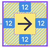
| Padding: icon only | 12 | 0.75 | spacing-03 |
| Label size | 16 | 1 | component-button |
| Icon size | 24 | 1.25 | spacing-05 |
Small

These are consistent between variants.
| Px / pt | Rem | Name | |
| Border radius | 4 | 0.25 | border-radius-xs |
| Border width | 2 | 0.125 | border-width-md |
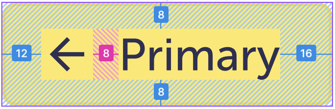
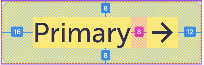
| Padding: text only | 8 16 | 0.5 | Spacing-02 spacing-04 |
| Padding: icon right | 8 12 8 16 | 0.5 1 | Spacing-02 spacing-03 Spacing-02 spacing-04 |
| Icon right spacing | 8 | 0.5 | spacing-02 |
| Padding: icon left | 8 16 8 12 | 0.5 1 0.5 0.75 | Spacing-02 spacing-04 Spacing-02 spacing-03 |
| Icon left spacing | 8 | 0.5 | spacing-02 |
| Padding: icon only | 8 | 0.5 | spacing-02 |
| Label size | 14 | 0.875 | component-button-small |
| Icon size | 24 | 1.25 | spacing-05 |
Primary
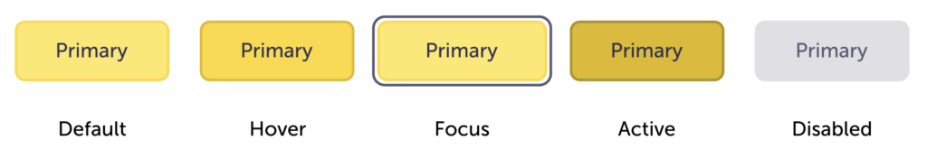
These are consistent between sizes.
| Primary | Default | Hover | Focus | Active | Disabled |
| Background color | $yellow-300 | $yellow-400 | $yellow-300 | $yellow-600 | $ink-200 |
| Border color | $yellow-400 | $yellow-600 | $yellow-400 | $yellow-800 | $ink-200 |
| Label color | $ink-800 | $ink-600 | |||
| Icon color | $ink-800 | $ink-400 | |||
Secondary
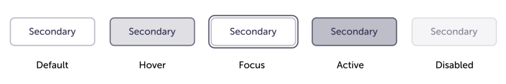
These are consistent between sizes.
| Secondary | Default | Hover | Focus | Active | Disabled |
| Background color | $white | $ink-200-multiply | $white | $ink-300-multiply | $ink-100 |
| Border color | $ink-300 | $ink-400-multiply | $ink-300 | $ink-400-multiply | $ink-200 |
| Label color | $ink-800 | $ink-400 | |||
| Icon color | $ink-800 | $ink-400 | |||
Tertiary
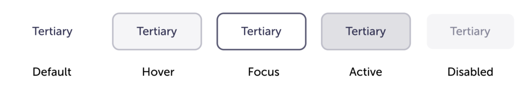
These are consistent between sizes.
| Tertiary | Default | Hover | Focus | Active | Disabled |
| Background color | – | $ink-100-multiply | – | $ink-200-multiply | $ink-100 |
| Border color | – | $ink-300-multiply | $ink-600 | $ink-300-multiply | $ink-100 |
| Label color | $ink-800 | $ink-400 | |||
| Icon color | $ink-800 | $ink-400 | |||
Destructive
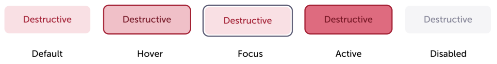
These are consistent between sizes.
| Destructive | Default | Hover | Focus | Active | Disabled |
| Background color | $red-100 | $red-200 | $red-100 | $red-300 | $ink-100 |
| Border color | – | $red-600 | – | $red-800 | – |
| Label color | $red-800 | $ink-400 | |||
| Icon color | $red-800 | $ink-400 | |||
Accessibility
- The Primary button is best used on white, Ink-800, or Ink-600 for the appropriate accessibility contrast.
- Make sure they are correctly labeled in the code so assistive technology can correctly interpret them.