
Cards
Overview
Definition
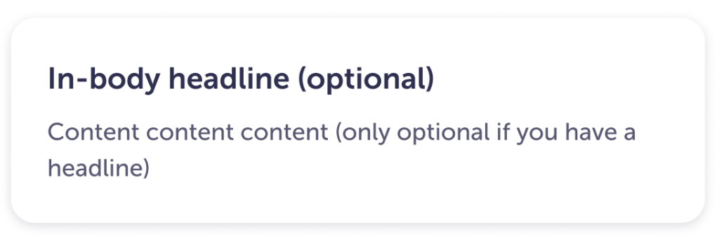
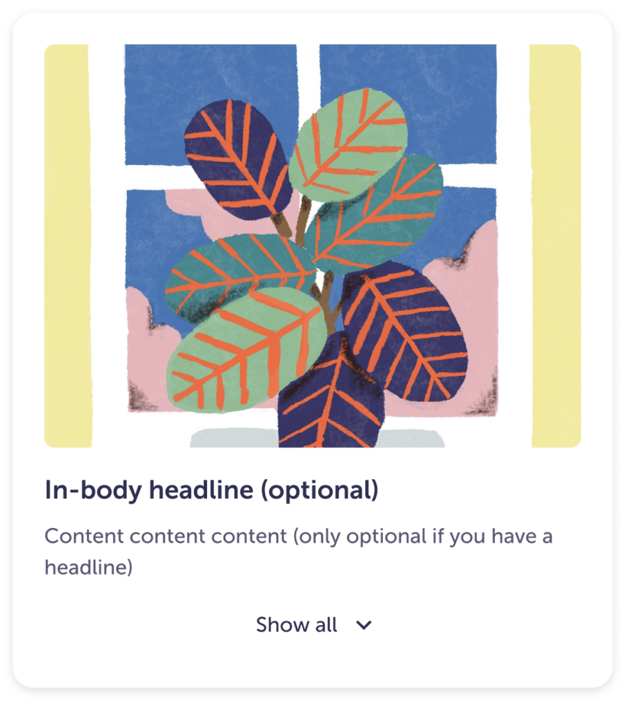
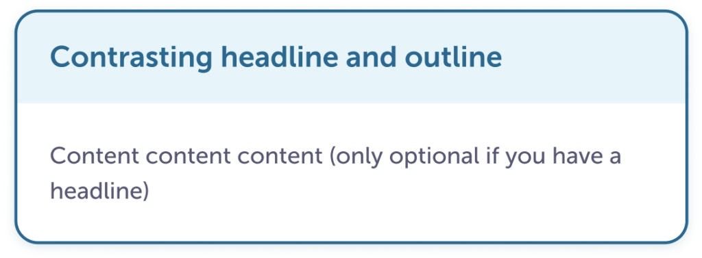
Cards are a container that displays content, images, and/or actions about a single piece of information.
We have three basic styles to start with:
Simple
Image
Outline
Guidelines
Content
- Headlines should be concise and related to the body copy.
- Body copy can get more indepth about the theme of the card.
- There is no limit to the height of the card, but think about how someone would read it. If it’s too long it may be best to link out to another page.
Visuals
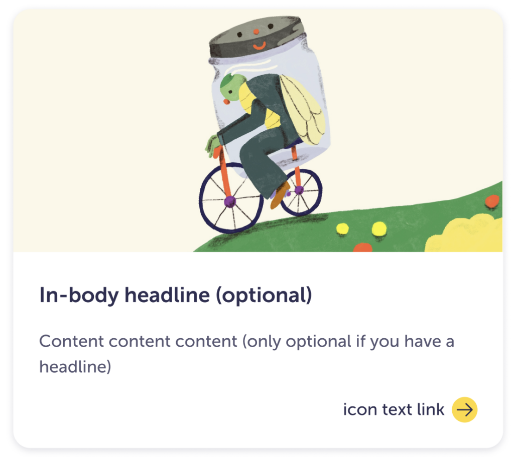
Here are a couple more examples, but they are only for ideas. These are not meant to be prescriptive.

- Don’t change the border radius—unless they are used within another container. Check out nesting elements within Spacing for more information.
- Image size is flexible, just make sure it’s size is not so big that it detracts from the rest of the information in the card.
- Limit the number of calls to action (CTAs) or interactive elements at the bottom of the card. One or two should be appropriate for most cards.
- If the card itself is interactive / acting as a link, provide an indication that it does something. Maybe a change in the dropshadow for example.
- Colors and typography can be changed, but do not use too many styles if you have several cards next to each other.
Specs
Since the cards are very flexible, these specs are a good starting point:
| Border radius | 24px |
| Border width | 2 px |
| Interior padding | 24px |
| Headline type size | headline-paragraph-large |
| In-body headline size | headline-paragraph-medium |
| Drop shadow | shadow-200 |
Accessibility
- Make sure to keep the contrast between typography and the card pass AA WCAG standards.