Checkboxes
Overview
Definition
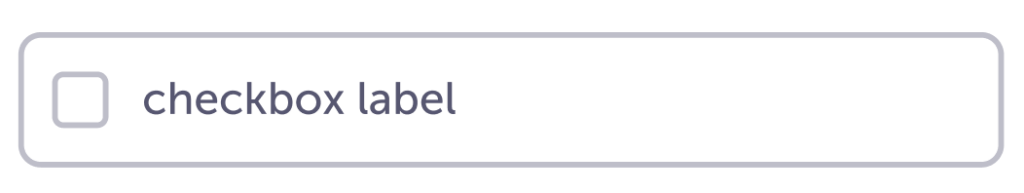
Checkboxes are used when someone can select more than one option from a list.
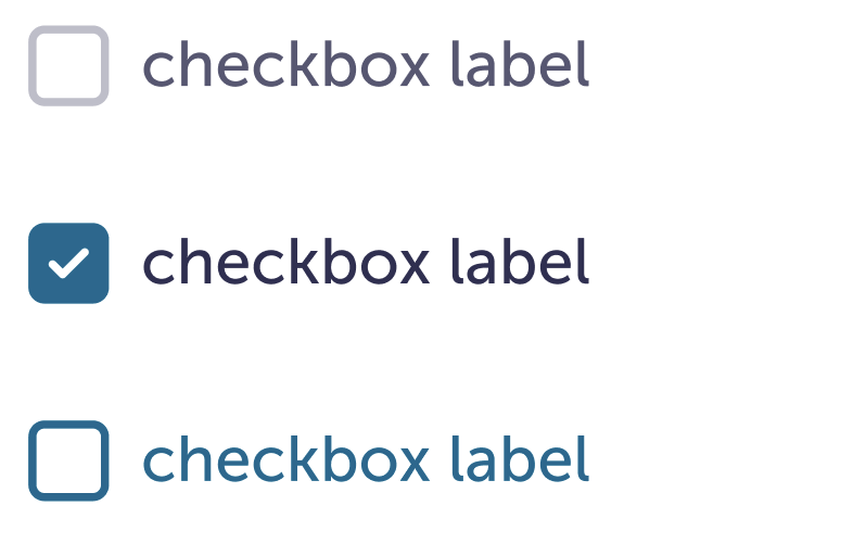
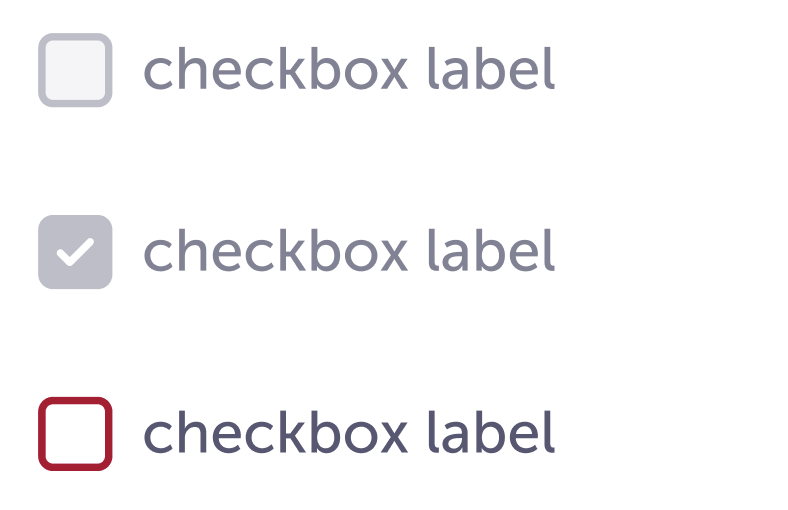
We have two variations
Small

Medium
Similar or related components
- Radios
- Dropdown selector (coming soon)
Guidelines
Small is used when visual space is at a premium and we need to save space. These can also be used in filters.
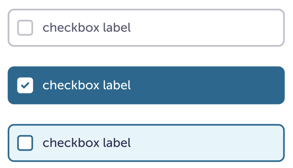
Medium is used most commonly in our forms.
If there are more than 7 options, a multi-dropdown selector may be more appropriate.
Content
- Small up to a few words
- Medium a word or two, to a simple phrase.
- If you have longer content for the options, i.e. a sentence that extends to the next line, stack all of the options.
- Try to use the same label heading size when possible.
- Keep answer structure consistent. If you use sentences, make all of them sentences. If you use a short phrase, make all of them short phrases.
Visual
- You can use a singular checkbox when needed.
- Keep the width of each checkbox button the same. If none of them are the full width of the container, flex to the length of the longest option.
Do
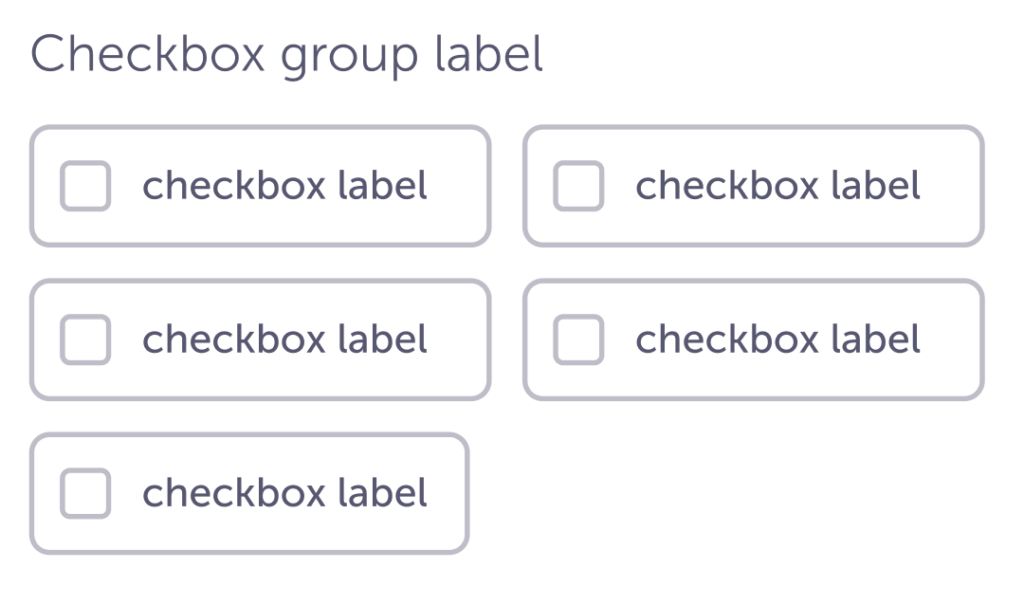
If you have more two or more shorter options, and the available space, you can align them side by side and then stacked. Keep it to two columns.
Do
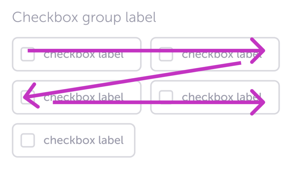
Use the z-pattern for stacked labels. Most people, at least in Western cultures, scan the first line left to right and then top to bottom. This way we use their reading pattern to optimize readibility.
Don’t
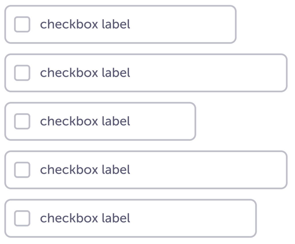
Don’t stagger the ends.
Caution
If you have more than 7 options, a multi-dropdown selector may be more appropriate.
Specs
Small
| Default | Hover | Selected | Disabled | Disabled and selected | Error | |
| Checkbox size | 20px | |||||
| Checkbox background color | $white | $white | $blue-800 | $ink-100 | $ink-400 | $white |
| Checkbox border color | $ink-300 | $blue-800 | $blue-800 | $ink-300 | $ink-300 | $red-600 |
| Checkbox border width | 2px | |||||
| Checkbox border radius | 4px | |||||
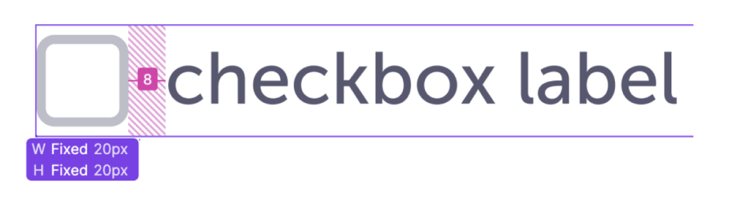
| Check icon size | 8px | |||||
| Check icon color | – | – | $white | – | $white | – |
| Padding-right | 8px | |||||
| Text size | body-m-500 | |||||
| Text color | $ink-600 | $blue-800 | $ink-800 | $ink-400 | $ink-400 | $ink-600 |
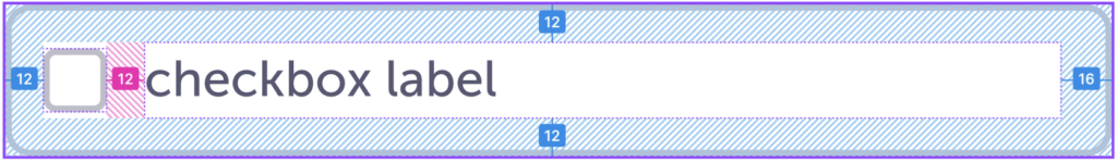
| Selectable area | Both the checkbox and text should be the one interactive space, this gives people more space to select the right option(s) for them | |||||
Medium
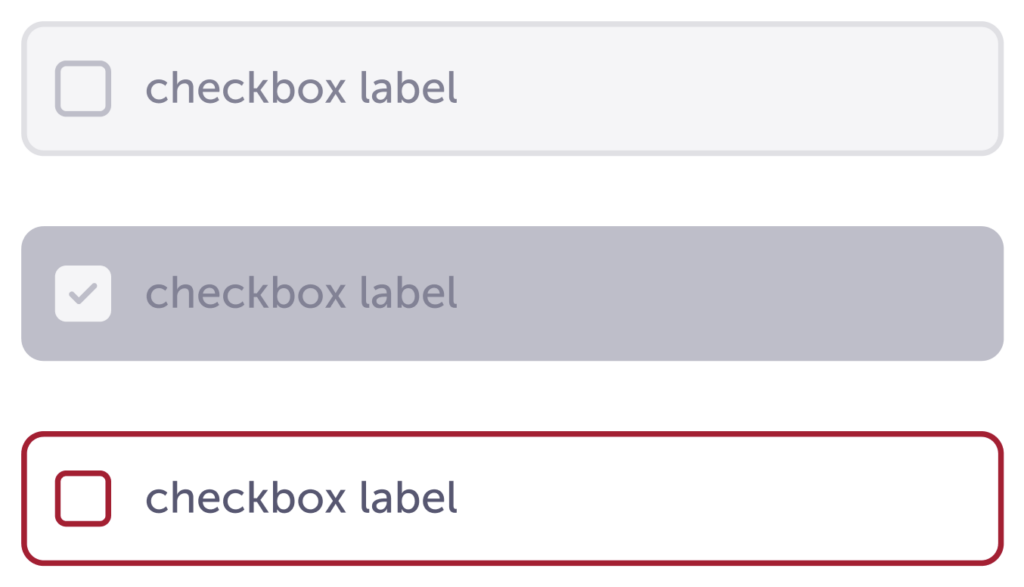
| Default | Hover | Selected | Disabled | Disabled and selected | Error | |
| Background color | $white | $blue-100 | $blue-800 | $ink-100 | $ink-300 | $white |
| Border width | 2px | |||||
| Border radius | 8px | |||||
| Border color | $ink-300 | $blue-800 | $blue-800 | $ink-300 | $ink-300 | $red-600 |
| Padding | 12px 16px 12px 12px | |||||
| Icon box size | 20px | |||||
| Icon box background color | $white | $white | $white | $ink-100 | $ink-100 | $white |
| Icon box border width | 2px | |||||
| Icon box border color | $ink-300 | $blue-800 | $blue-800 | $ink-300 | $ink-300 | $red-600 |
| Icon box border radius | 4px | |||||
| Icon padding right | 12 px | |||||
| Text size | body-m-500 | |||||
| Text color | $ink-600 | $blue-800 | $ink-800 | $ink-400 | $ink-400 | $ink-600 |
Accessibility
- passed AA WCAG contast
- keyboard friendly