Grid and layout
Overview
There are the foundations and overarching structure of our user interfaces and components. They allow us to create designs that are consistent across multiple sizes or screen types.
Most of our users have a bit of screen space—more than half of our users have a screen size between 1920 x 1080px and 1280 x 720px! We can use that space to keep the elements and styles friendly and bold on the desktop. The closer things become, the more dense and unfriendly the layout can get.
At larger screen sizes, try to use more breathing room. Deep breath in. Deep breath out. Or white space, or negative space. It has a lot of names. But whatever you call it, ALEX is friendly and so are our visual interface.
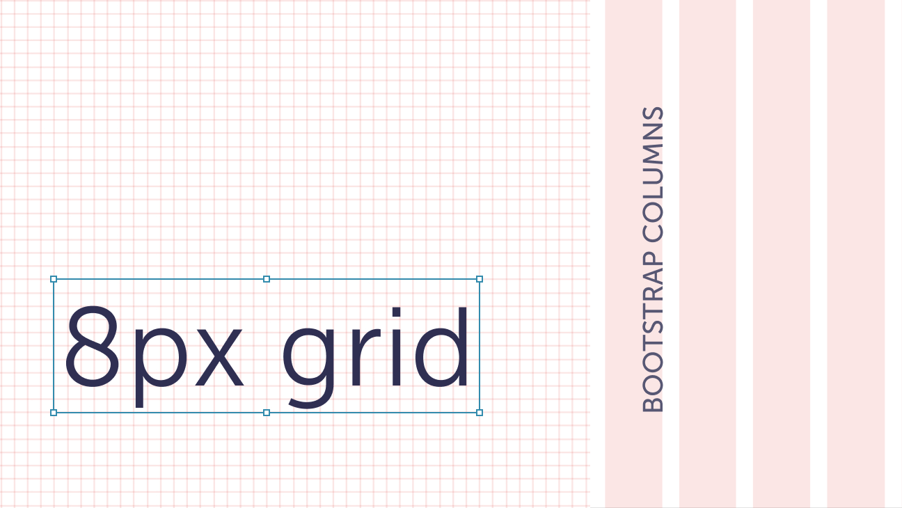
Built on an (almost) 8px grid and 12 columns
8px grid and 12 columns are used mostly by designers, and Bootstrap is used to implement those elements.
ALEX is a take on the 8px grid that is commonly used in a lot of UI and visual design patterns across the internet. Having a consistent grid will allow us to keep components, patterns, and layouts more consistent.
While most of the larger layouts and grid guides should follow the 8px grid—we’ll use the 4px for smaller component details and dense smaller layouts. This is why we call it the almost 8px grid. Just try to use 8px or 16px increments when you can!
Check out Spacing for more guidance on vertical flow and general spacing guidelines.
For extremely in-depth documentation on this grid system, check out the Bootstrap Grid documentation page.
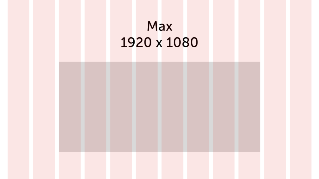
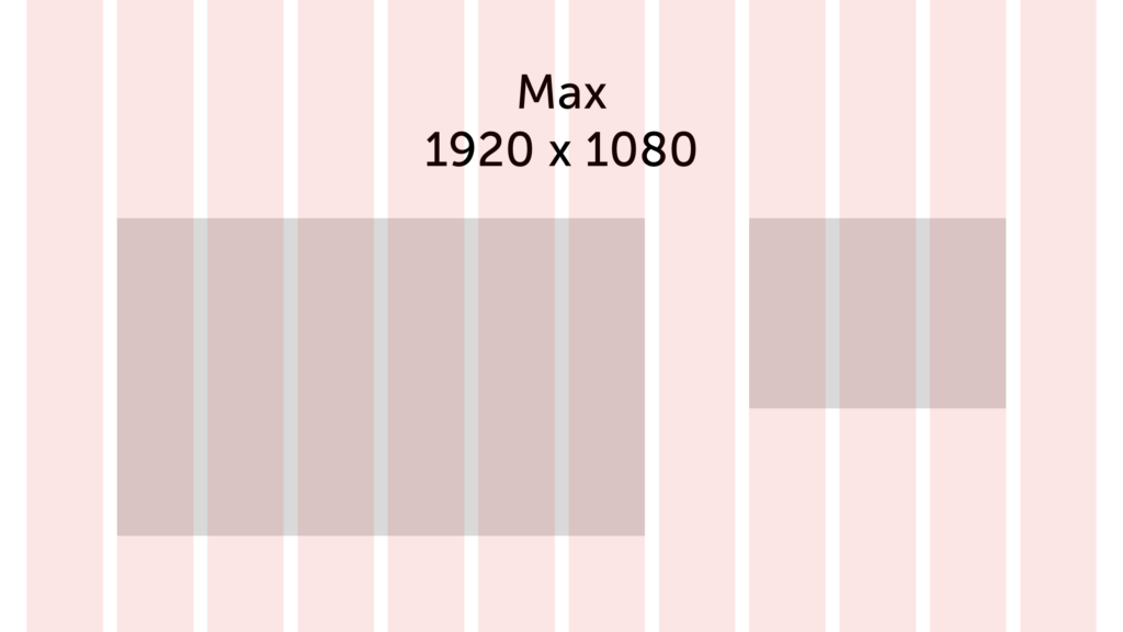
Desktop (Large and Max)
- 12 flexible columns
- Gutters: 24px
- Margin: 24px (Large) and (48px for Max)

This is a lot of space to play with, but you don’t have to use all of the columns every time. Feel free to mix and match. Leave a column or two space between other components if you want. With this size, one thing to pay more attention to is the length of sentences. Review Typography for information about best practices.
The following are examples for layouts, they are not meant to be prescriptive. And, they aren’t the only ideas. How would you use this space?
Tablet
- 6 flexible columns
- Margins and gutters: 16px
- Similar to the desktop view, easier to have multiple layouts, but with a few less columns.
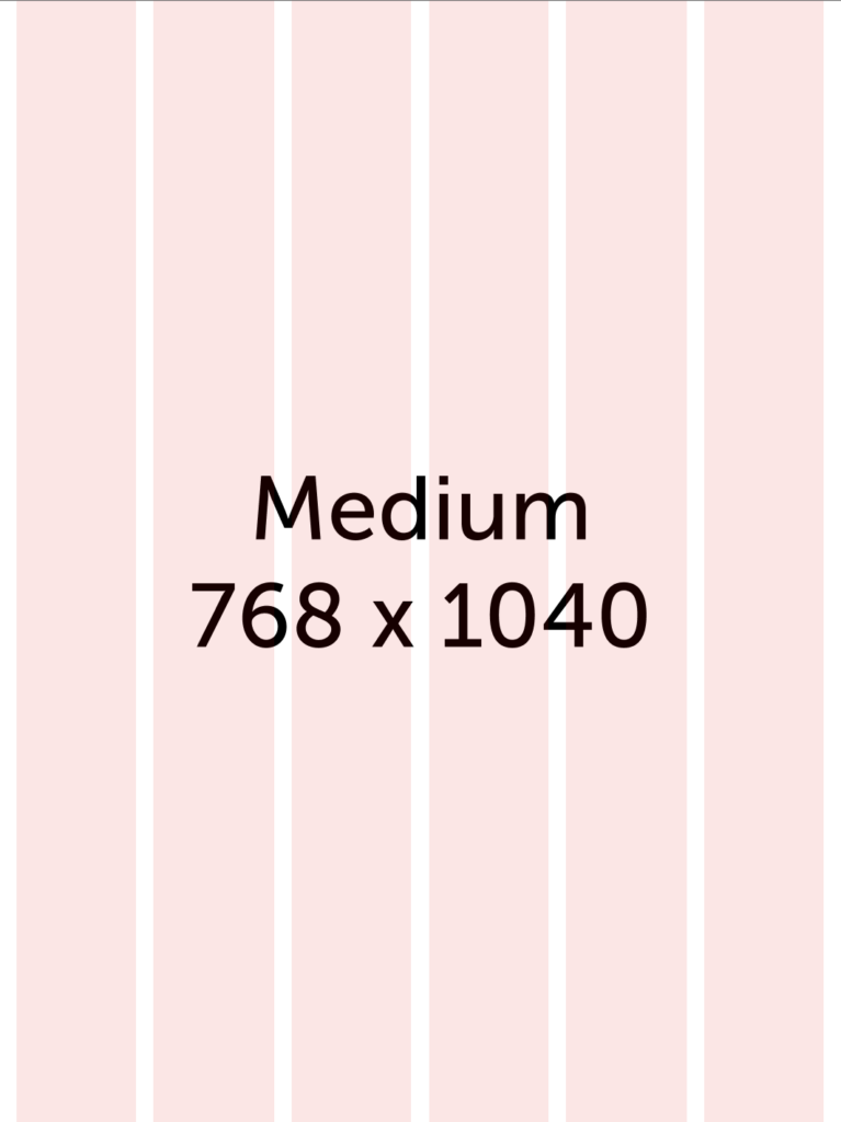
While we don’t have many tablet users, that doesn’t mean you shouldn’t consider how things will scale. There are only 6 columns now, so decide what needs to stack vs what doesn’t.
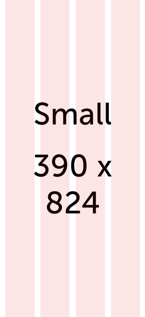
Mobile
- 4 flexible columns
- Margins and gutters: 16px
Even though most of our users are on desktop, mobile can be a great place to start. When you consider the information hierarchy of the page it also acts as a wireframe for mobile—since many components and pieces of content will stack. So it’s a win-win!
Even though many components are full-width at mobile, don’t let that limit your creativity!
Specs
Screen breakpoints
| Screen size | Class infix | Breakpoint (px /rem) | Columns | Gutters (px / rem) | Margins (px /rem) |
| Small (Mobile) | – | <576 / 36 | 4 | 16 / 1 | 16 / 1 |
| Medium (Tablet) | md | 768 / 42 | 6 | 16 / 1 | 16 / 1 |
| Large (Desktop) | lg | 1024 / 64 | 12 | 24 / 1.25 | 24 / 1.25 |
| Max (Large Desktop) | max | 1824 / 114 | 12 | 24 / 1.25 | 48 / 3 |
8px-ish grid
| Name | Size (px / rem) | Description |
| spacing-00 | 0 / 0 | Not super common. We’ll call these twins, this is when things need to be pretty much as close as you can get. |
| spacing-01 | 4 / 0.25 | Most common in components. Your favorite sibling or best friend, and a bonus if they are both! |
| spacing-02 | 8 / 0.5 | Smaller default, used more often within components. They are like your second favorite sibling or a close cousin |
| spacing-03 | 12 / 0.75 | Also used more often in components. |
| spacing-04 | 16 / 1 | Default, can be used in components for spacing between elements or spacing between on-page components. They are a “work” friend, you may spend a lot of time together, but don’t see as much of each other outside of work |
| spacing-05 | 20 / 1.25 | This is most common in component and icon sizing. The padding in icons will usually make the icon 16px when needed. |
| spacing-06 | 24 / 1.5 | Layout / spacing default, can be used in components for spacing between elements or spacing between on-page components. |
| spacing-07 | 32 / 2 | Can be used for larger component spacing, but more often for layout. They are a distant cousin, you may see them a couple times a year. |
| spacing-08 | 48 / 3 | The Kevin Bacon of separation, that was a bad joke. These should be used for layout spacing more than anything. |
| spacing-09 | 64 / 4 | Layout spacing. For example, it could be how you want to keep extra space between the main navigation and body content. |
| spacing-10 | 80 / 5 | Layout spacing. |
| spacing-11 | 128 / 8 | Layout spacing. This is your cousin’s friend’s spouse, you’ve met once before, you think. |