Radios
Overview
Definition
Radio buttons are used when someone needs to pick one option from a specific list.
There are three variations:
Small

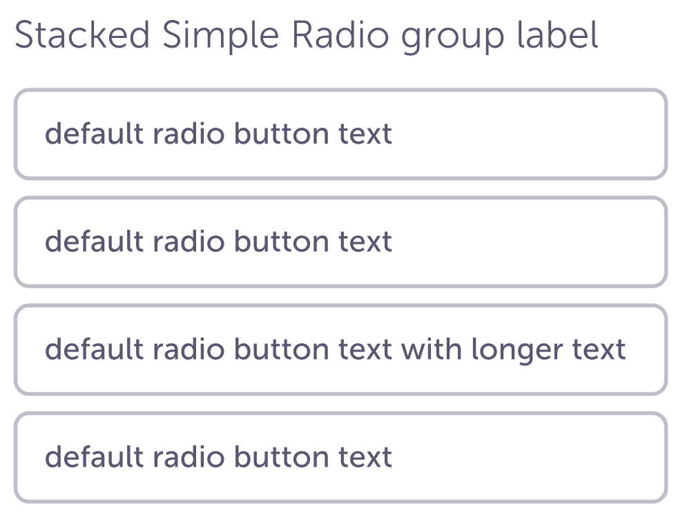
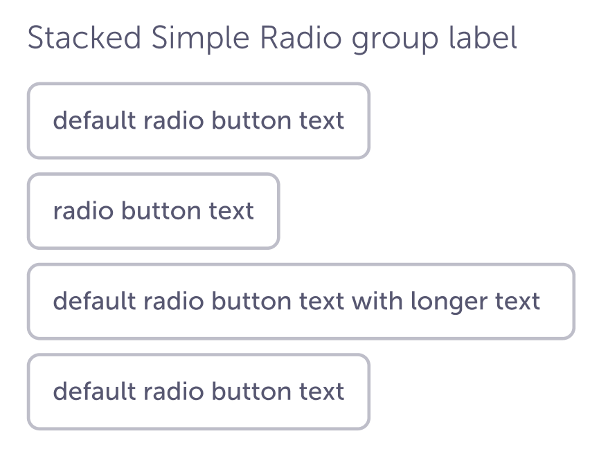
Simple
Headline
Similar or related Components
Guidelines
Small is used when visual space is at a premium and we need to save space. These are commonly used in filters.
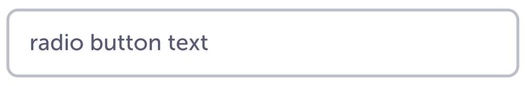
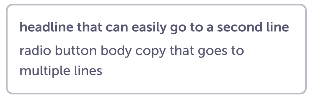
Simple and Headline are most commonly used in forms. To alleviate visual noise, these radio buttons do not use the standard circle. They still act in the same way as the Small. Someone can only choose a single option from the list.
If more context is needed, we have an option that includes a headline. The content should still be concise so someone can easily review options.
Ideally, the most common choice is preselected to save people a little time and help them understand that only a single option can be selected. But depending on the use case, we don’t have to preselect an option.
Content
For Small, use a word or two.
For Simple, a few words up to a simple sentence.
For Headline, these are for instances when we need to provide more context. For example, when we ask people about their preference for paying more out of pocket a month vs less out of pocket a month.
Visuals
Do
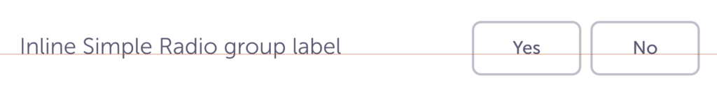
If you have two–four simple options, you can align them side by side, e.g. yes / no. If label is a single line, align text to the baseline.
Do
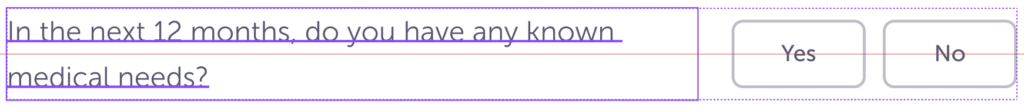
For inline, if there is more than one line for the label, align to the middle of the container.
Do
Keep the width of each radio button the same. If none of them are the full width of the container, flex to the length of the longest option.
Don’t
Don’t stagger the ends.
Caution
If you have more than 4 options to choose from, a Dropdown selector may be more appropriate.
Specs
Small
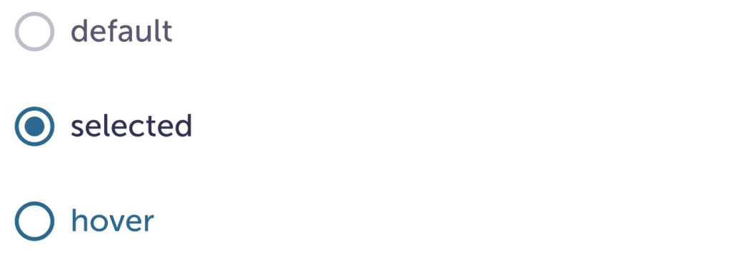
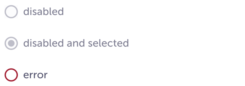
| Default | Hover | Selected | Disabled | Error | |
|---|---|---|---|---|---|
| Background color | – | – | – | $ink-50 | – |
| Border radius | border-radius-max: 50% | ||||
| Border width | border-width-md | ||||
| Border color | $ink-400 | $blue-800 | $blue-800 | $ink-400 | $red-600 |
| Icon size | 20px | ||||
| Icon fill color | – | – | $blue-800 | $ink-400 | – |
| Icon fill size | – | – | 10px | 10px | – |
| Padding-right | spacing-03 | ||||
| Text size | body-m-500 | ||||
| Text color | $ink-600 | $blue-800 | $ink-800 | $ink-400 | $ink-600 |
| Selectable area | Both the icon and text should be the one interactive space, this makes it easier for people to choose the right option. | ||||
Simple

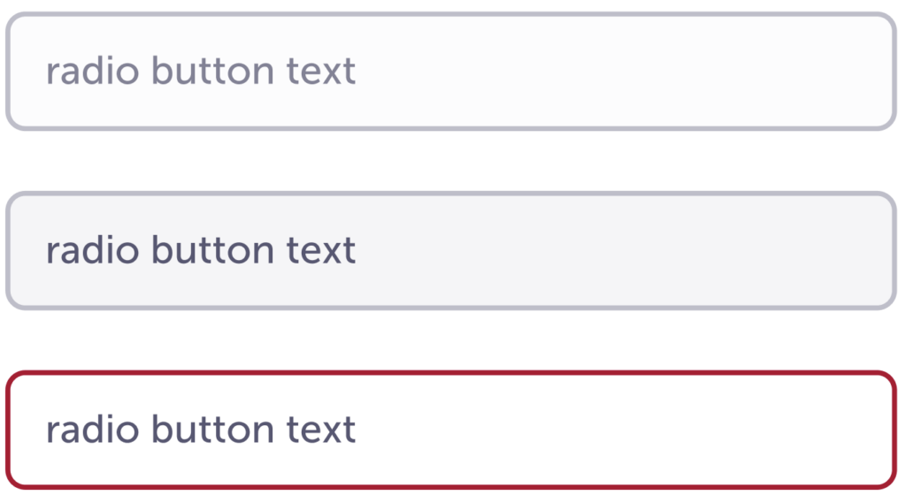
| Default | Hover | Selected | Disabled | Error | |
|---|---|---|---|---|---|
| Background color | – | – | – | $ink-50 | – |
| Border radius | border-radius-max: 50% | ||||
| Border width | border-width-md : 2px | ||||
| Border color | $ink-400 | $blue-800 | $blue-800 | $ink-400 | $red-600 |
| Padding | spacing-03 spacing-04 : 12px 16px | ||||
| Text size | body-m-500 | ||||
| Text color | $ink-600 | $blue-800 | $ink-800 | $ink-400 | $ink-600 |
Headline
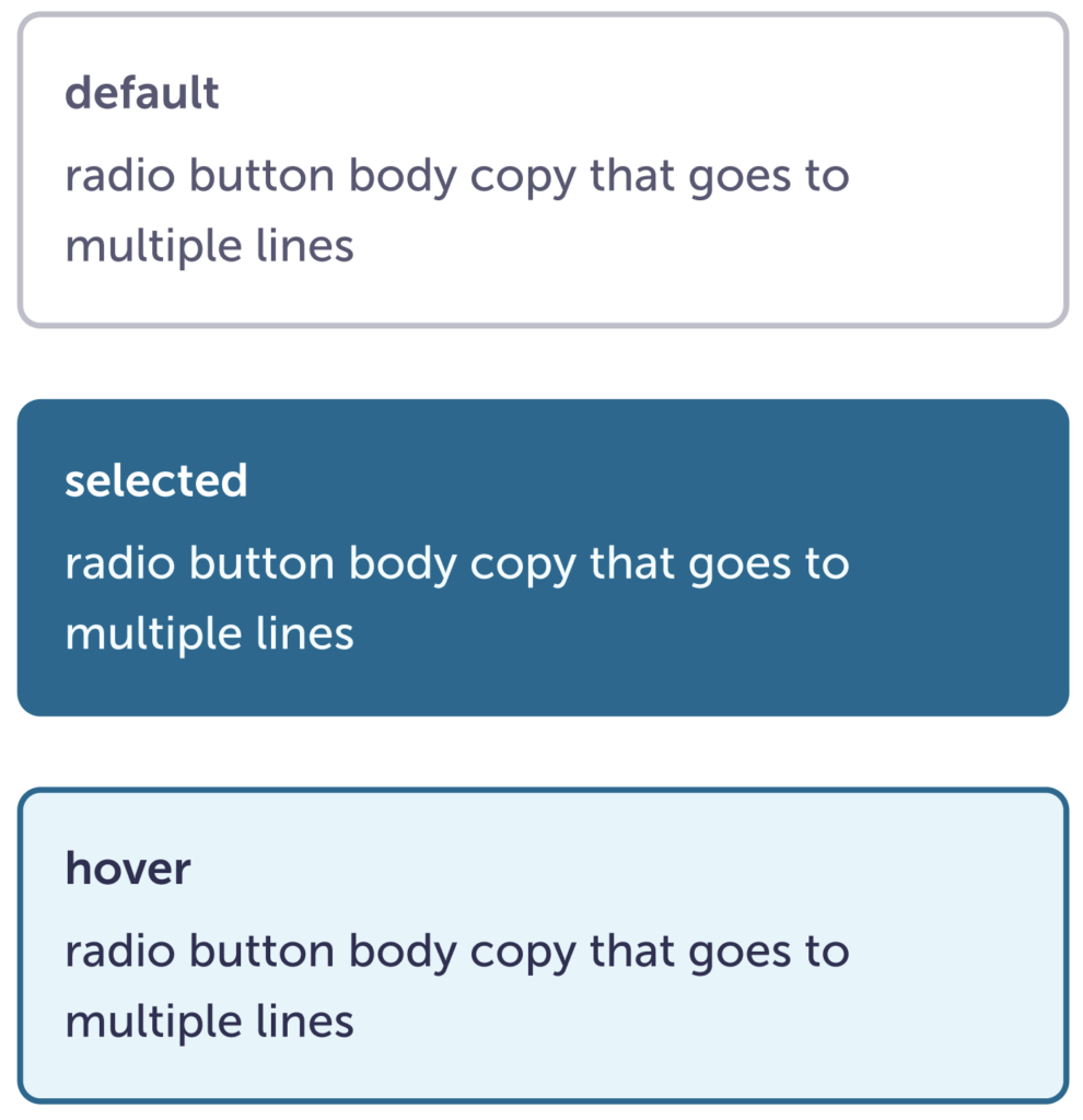
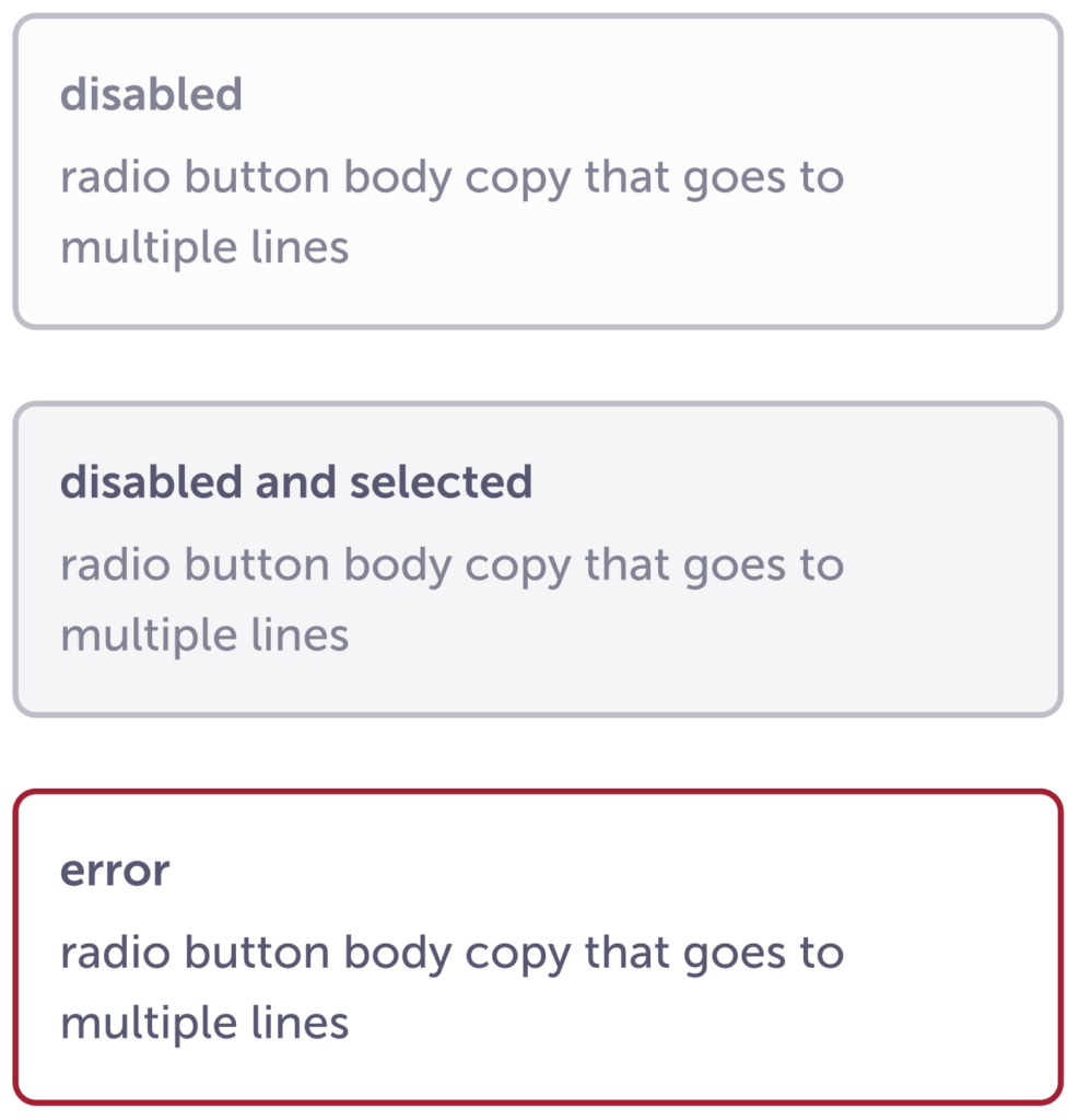
| Default | Hover | Selected | Disabled | Error | |
|---|---|---|---|---|---|
| Background color | $white | $blue-800 | $blue-800 | $ink-50 | $white |
| Border radius | border-radius-sm : 8px | ||||
| Border width | border-width-md : 2px | ||||
| Border color | $ink-400 | $blue-800 | $blue-800 | $ink-400 | $red-600 |
| Padding | spacing-04: 16px | ||||
| Headline size | paragraph-header-m | ||||
| Headline color | $ink-600 | $ink-800 | $white | $ink-400 | $ink-600 |
| Headline padding | spacing-02 : 4px | ||||
| Body copy size | body-m-500 | ||||
| Body copy color | $ink-600 | $ink-800 | $white | $ink-400 | $ink-600 |
Accessibility
- Keyboard accessible
- AA contrast ratio checked and passed