Side sheet
Definition
Progressive disclosure container that’s fixed to the side of the screen that contains supporting information. We have two types:
Overlay
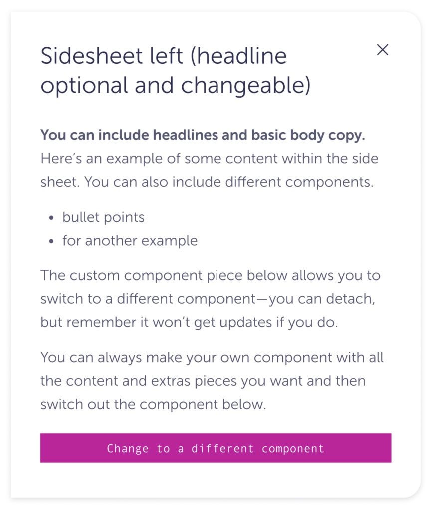
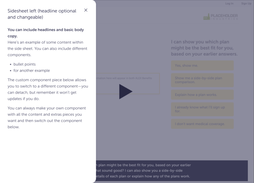
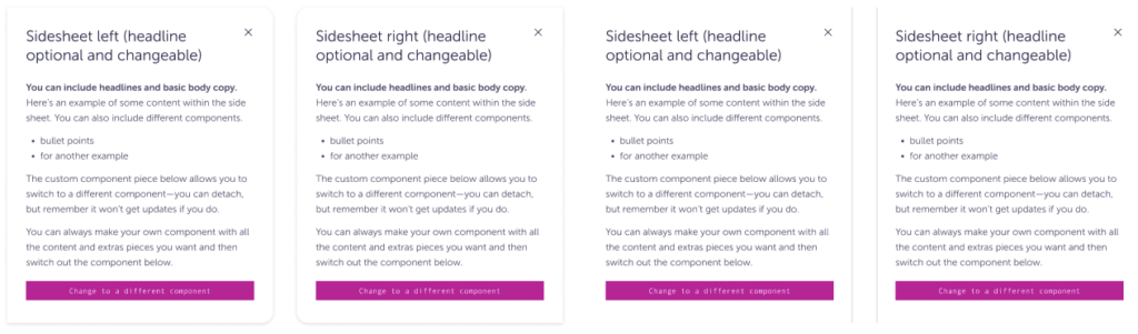
Left
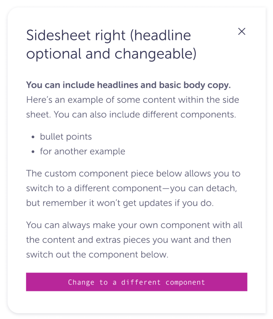
Right
Inline
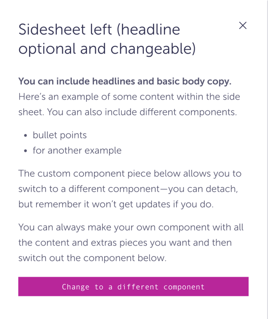
Left
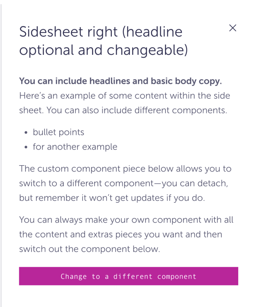
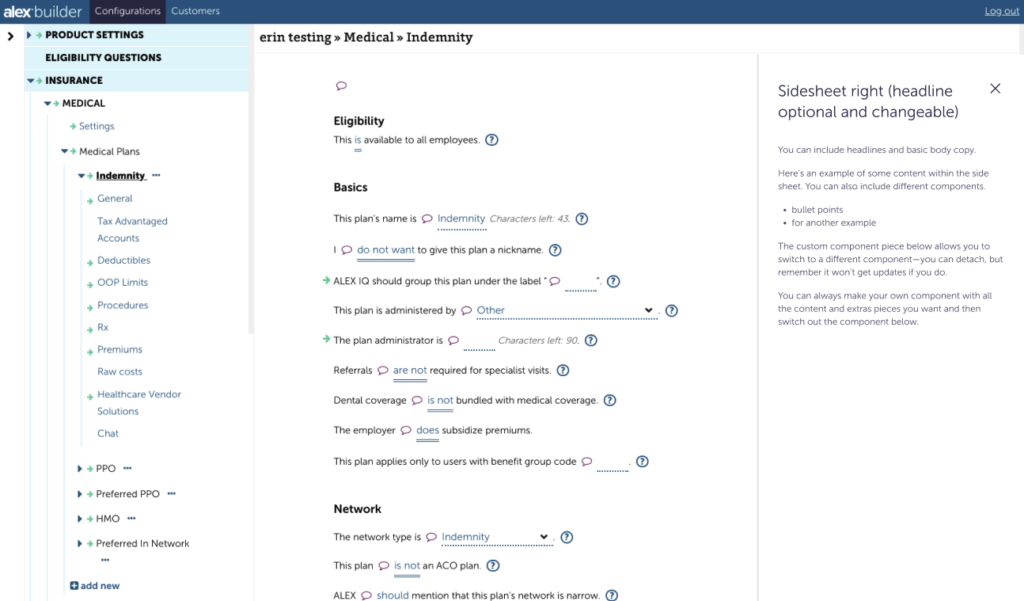
Right
Similar components
Guidelines
A single place to include supplemental information related to the main page. These are open to multiple forms of content and media to help someone understand more about what’s on the main screen. Similar to Modals, these can distract someone from the main piece of information on the page and should be used less frequently.
Overlay is used when the information is more supplemental and doesn’t need to be visible all the time. This is commonly used in BC and Go.
Inline is used when the content within may need to be referenced more often and when the rest of the screen is still functional. This is more common in Builder.
Content
- Don’t hide mandatory or important information in the side sheet.
- Sidesheets can house many types of content and/or information. Things like video, accordions, images, tabs, etc. It can also use any of the same visual styles of a main screen—just no additional H1s.
Interactions
- It needs a button to open. How the button is styled is open to the experience—just don’t use a Primary button. Common examples are an icon in Builder or the Menu in BC.
- Can be closed by clicking (or interacting) outside of the container. HOWEVER, it still needs a visible close button within the side sheet.
- Can be opened to the right or left. Right is more common for supplemental information, and the left is more common for menus or navigation.
- If there is more content than is visible in the viewport, someone will be able to scroll within the container.
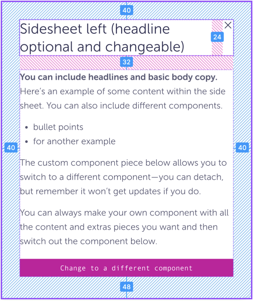
Visual
- For Overview, the default height is the full height of the view port. For Inline, it’s the height of the container that it’s in.
- The default width is 560px, but it can change with the type of screen size—say mobile / tablet vs desktop.
- You can change the padding for smaller containers. The default is 40px, but you can use less for complex pages and smaller container.
Do
When using the Overlay version, the main window should darken when the sheet is open.
Do
If people still need to see and interact with what’s on the main screen, use the Inline version.
Caution
Try not to change the background from white—or change the border radius, shadow styling, or border.
Don’t
Hide how to exit or close the Side sheet. There needs to be an easy to see way to close out of the side sheet.
Specs
Default specs
| Overlay — Left | Overlay — Right | Inline — Left | Inline — Right | |
| Background color | $white | |||
| Border radius | spacing-00 border-radius-lg border-radius-lg spacing-00 | Border-radius-lg spacing-00Spacing-00border-radius-lg | n/a | n/a |
| Border size | n/a | n/a | border-width-md | border-width-md |
| Border color | n/a | n/a | Right only: $ink-200 | Left only:$ink-200 |
| Padding | spacing-08 | |||
| Drop shadow | shadow-200 | shadow-200 | n/a | n/a |
| Title size | headers-medium-300 | |||
| Title color | $ink-600 | |||
| Icon size | spacing-06 | |||
| Icon color | $ink-600 | |||
Accessibility
- Everything within the Sheet should follow their specific accessibility requirements.
- The Sheet can be closed with keyboard, assistive technology, or mouse.