Spacing
Overview
This is where we get into nuances within the layout of the screen. The layout guides the general structure of different screens, and its information. Spacing defines relationships between the elements. Where friends and distant acquaintances are defined.
Vertical flow and visual hierarchy
There are multiple ways to change visual hierarchy, for this we’re gonna talk about one piece: vertical flow. This is especially important on desktop, when it can be easy to keep a lot of things really close.
The closer items are together, the easier it is to see them as related. And it’s the opposite when items get further away from each other, they will not seem related. Like, I’ll let my best friend give me a big hug, but my cousin’s friend’s spouse? Probably not when I first meet them.
If the space is the same between everything it will be hard to distinguish what someone should focus on. Keeps friends closer, and cousin’s friend’s spouses further away.
To relate that to long-form content (or say, blog posts), we have the headline closer to the content directly following it, and not the content preceding it. The headlines are distant cousins to the previous content but friends to the content under. Try not to make them the same size when it can be helped, and they definitely should not be reversed.
Rows and stacking elements
To start with, stick to similar sizes as the gutters. For example, if you’re creating a desktop screen, start with 24px between elements / components and then refine from there. The larger the screen, the larger you can get with spacing while still being cohesive.
Also think about the type of content. If someone needs to review a bunch of pieces of information, like a super dense table, then it may be fine to have less space between items.
How much content fits into a row varies on the size of the screen. Since the web is responsive, so is the content (most of the time). Content may be one row on desktop and 3 or 4 on mobile.
Follow the 8px grid when in doubt.
Nesting elements
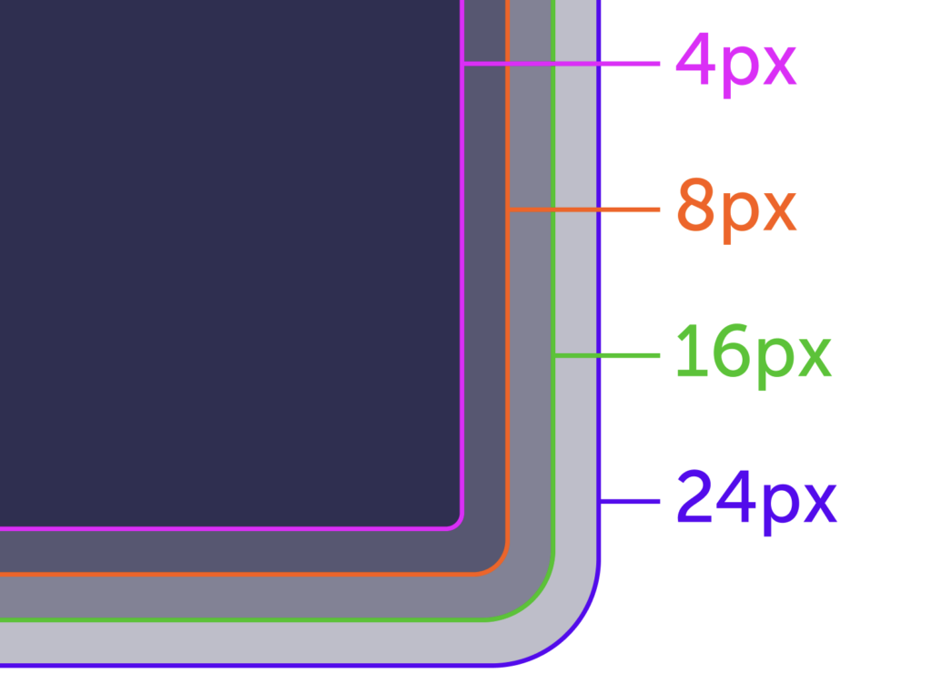
When putting elements or components within each other, pay attention to the border radius of each item. Try to make 24 the outer most radii. By doing this we are keeping the space visually equal. If you kept them all the same it creates an awkward corner.
Do
Use the 8px grid when nesting components or elements within each other.
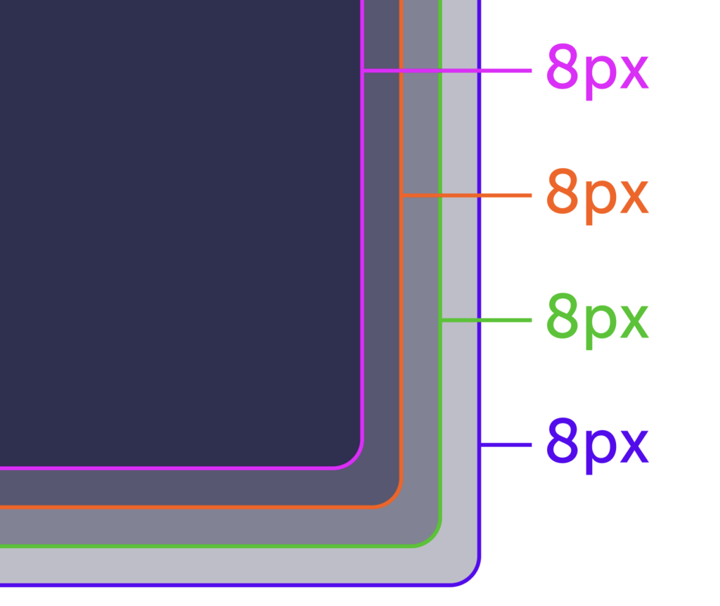
Don’t
When the same radii is used for all nested items, it creates an awkward corner.
Sizing defaults
These are guidelines to help you get started. It’s always up to the experience and what we are trying to communicate to people to find the best sizing. Things closer together will be seen as related and things father apart will seem unrelated (or less related).
Layout spacing
Spacing-04, spacing-06, spacing-07
Spacing between elements on the page, padding for some components, or spacing between elements in a component are the most common for these layout sizes.
For example, spacing between cards or form fields.
Component spacing
Spacing-01, spacing-02, spacing-03
Spacing between related elements within a component.
For example, the icon in Notification Banners: they are 12px apart while the main content is 24px apart from the CTAs. That’s because the icon is related more to the content than it is to the actions.
Check out Grid and layout for all available sizes.