
Tables
Overview
Definition
Tables are used to present related information in a structured format.
We have two types:
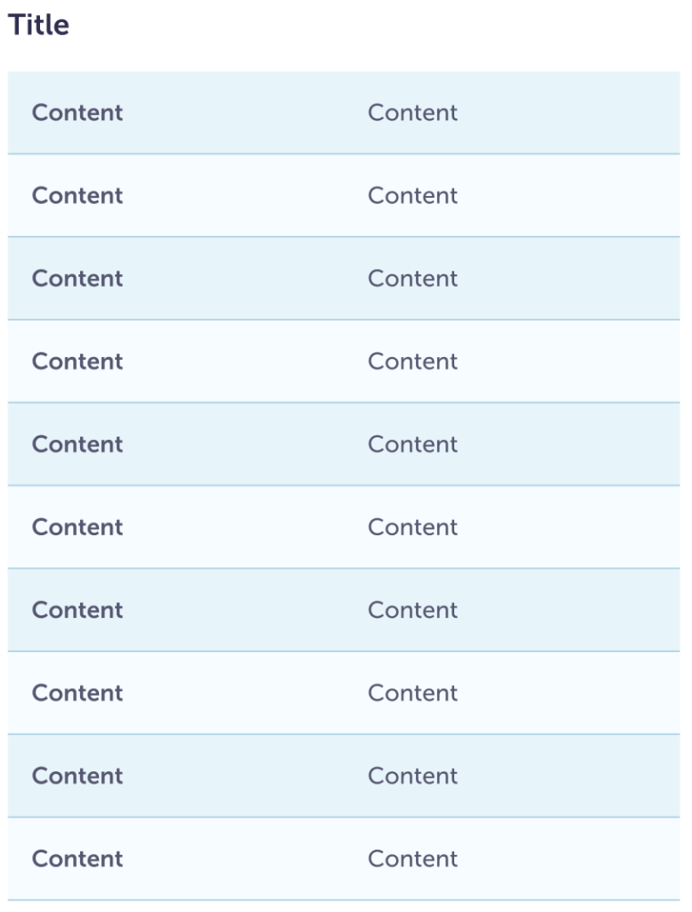
List
most commonly used for definitions or simple structured content
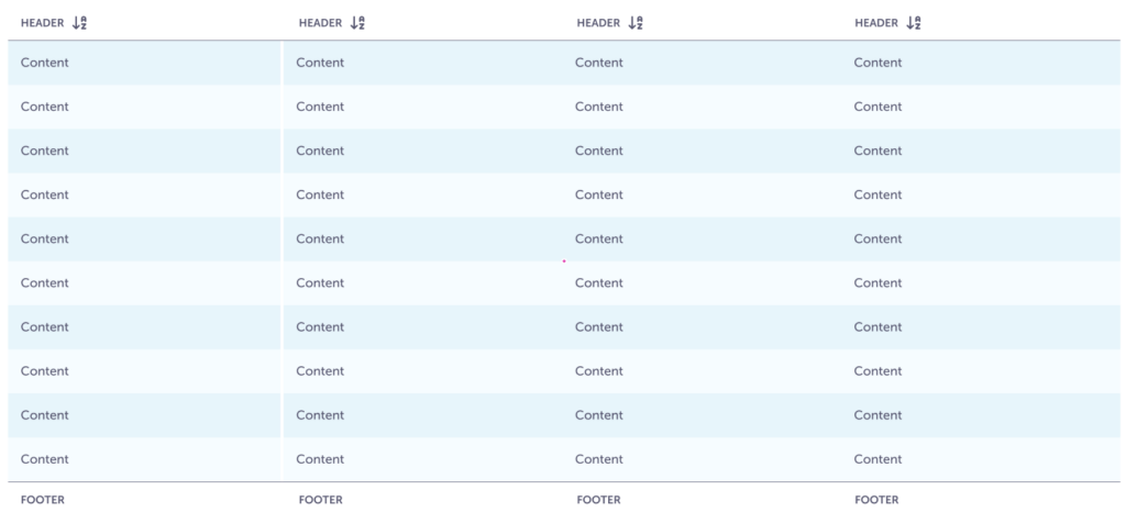
Data
probably what you think of when you think of a table. Multiple rows and columns that you can use to review and compare pieces of information.
In a few styles:
- Zebra striping (default)
- Underline
- Contrast
Guidelines
Content
- Try to keep the content precise so the rows do not get too tall.
Visual
The zebra styling provides better readability, it visually connects rows of information so people can scan for the appropriate information.
If you only have a few items in a list, you may be able to use underline without losing readability.
List
- This is for simple lists, simple math calculations, and definition lists.
- The columns can be either right or left aligned.
- If you need more than 3 columns, a Data table may be better.
Zebra stripping
Provides the best readability. If you have longer definitions, this could be helpful for people to keep their place in the list.
Underline
Useful when you have a limited number of items to define. Or, if you are showing a simple calculation, underline keeps the focus on the figures.

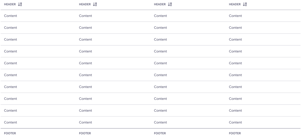
Data
This is for larger collections of information and data.
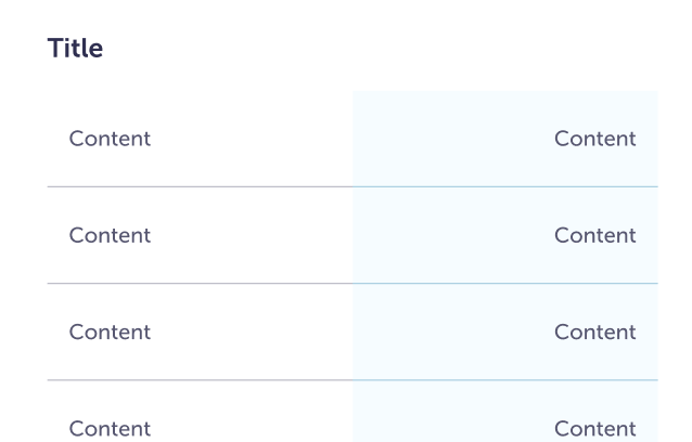
Zebra striping
Provides the best readability. If your list is meant to mostly be perused and maybe some simple sorting.
Underline
If you need to include interactive elements within a row, make multiple changes, or quickly scan to see statuses then underline may be better. When someone hovers over a row, it will have a higher contrast and any colored elements will stand out more.
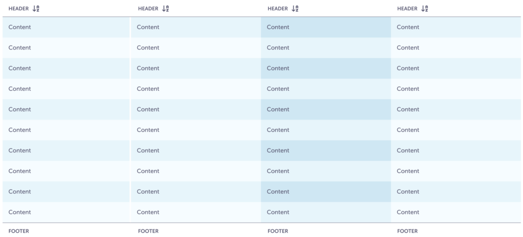
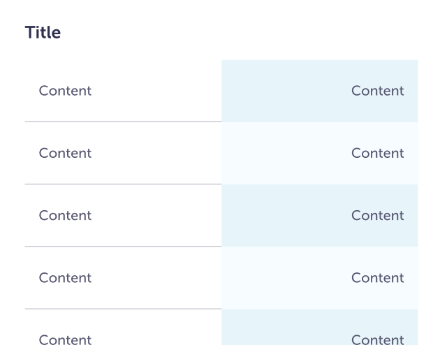
Contrasting columns
When you have to compare data, use a contrasting column to help differentiate the information.
Zebra contrasting
Start contrasting with the third column and then every other one. So 3, 5, 7, etc. This way when someone first lands in this space they can quickly scan and familiarize themselves with the style.
Underline contrasting
Similar to zebra striping, start contrasting with the third column.

Don’t
Don’t use contrasting columns with the List.
Don’t
Don’t mix Zebra and Underline together.
Cell sizing
This is related to the padding of each individual cell. You can change the size and weight of the text, just be careful it doesn’t make it harder to read.
Medium
Used when space is at a premium and people need to review a lot of information on a single screen.
Large
Used when we have room to give text space. More common in Decision Support.
Specs
Cells
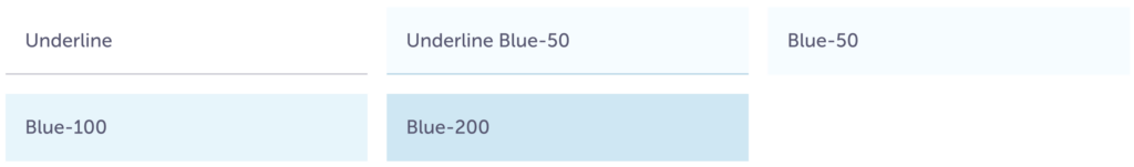
| Underline | Underline Blue-50 | Blue-50 | Blue-100 | Blue-200 | Header | Footer | |
| Background color | – | $blue-50 | $blue-50 | $blue-100 | $blue-200 | – | – |
| Border placement | bottom | – | – | – | bottom | top | |
| Border width | 1 px | – | – | – | 1 px | ||
| Border color | $ink-300 | $blue-300 | – | – | – | $ink-400 | |
| Font size | body-medium-500 | header-allcaps-small | |||||
| Font color | $ink-600 | ||||||
| Height | Varies with the content, but try not to make them too tall that it gets hard to read between cells. | ||||||
| Max-width | Varies with the content and space on the screen. They are flexible so that all columns don’t need to be the same width. | ||||||
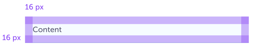
List columns
Try not to use more than three.
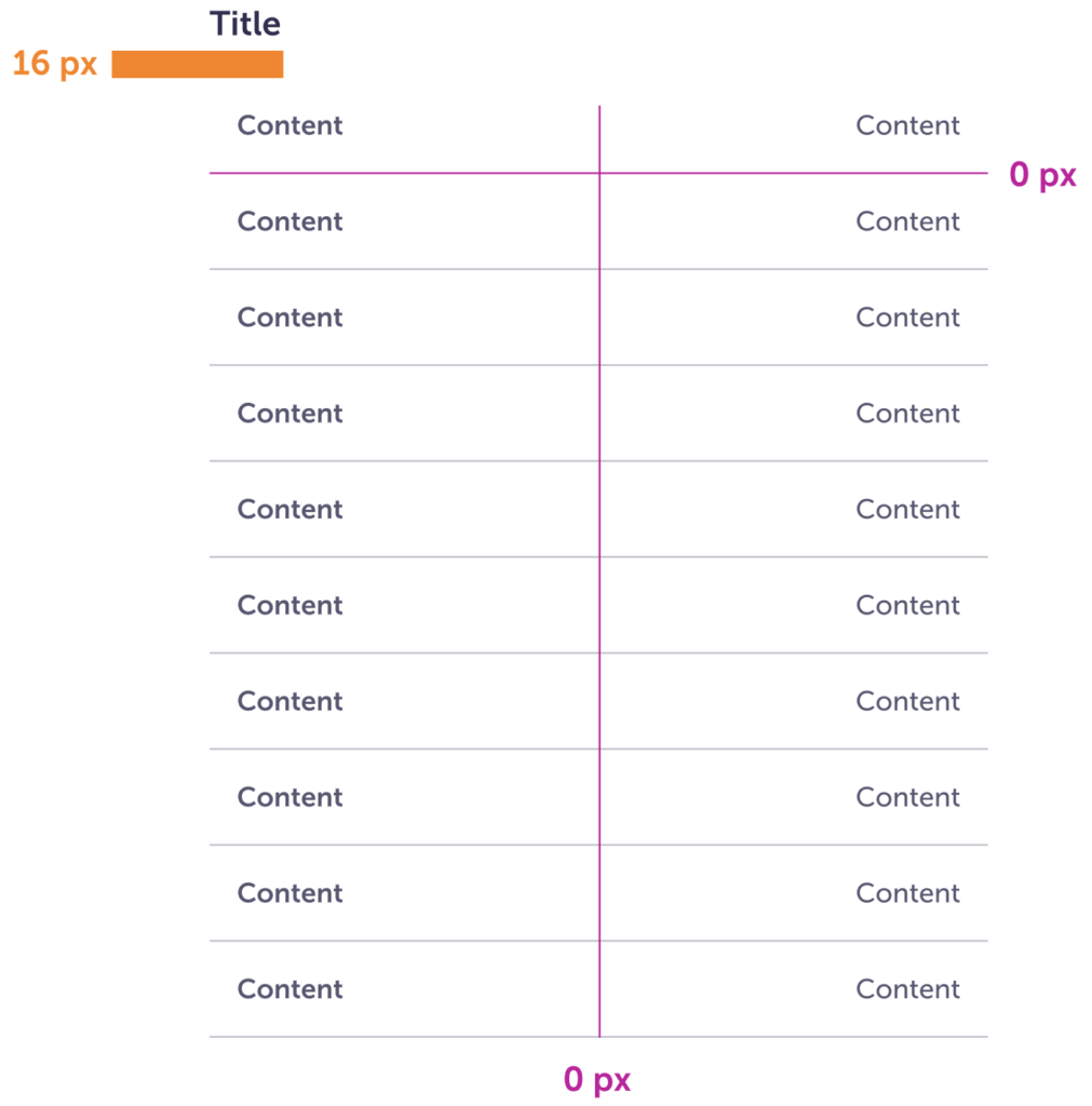
| Title | Columns | Rows | |
| Spacing | 16px | 0px | 0px |
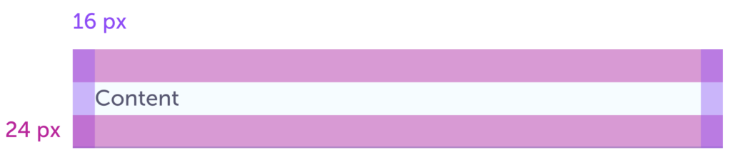
Data table columns
Open to as rows and columns as needed. The first column and row can be sticky when scrolling horizontally or vertically are needed.
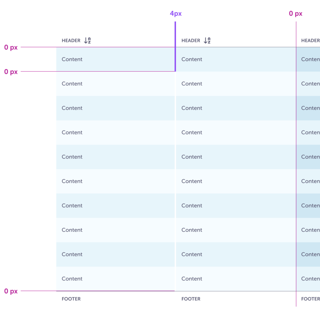
| Header | First column | Other columns | Rows | Footer | |
| Spacing | 0px | 4px | 0px | 0px | 0px |
Accessibility
- Colors pass AA WCAG color contrast.
- Can be used with a keyboard in addition to hover.