
Text inputs
Overview
Definition
Text inputs are best for freeform text. This could be an email address, best friend’s phone number, or mother’s maiden name.
Variations
We have several variations
- Input only
- Icon left
- Icon right / Search
- Text area
Each with these states
- Default
- Hover
- Active
- Error
- Disabled
Guidelines
These are used for when a user needs to input free-form information. The size of the input should reflect the content. Except for the text area, the rest of the inputs have a height of 48px to match the size of the most common button.
Content
- While the input is up to the user, the label should be concise. The label can extend to another line if needed.
- Error messages should help people resolve the issue.
Visual
- Can be stacked or inline
- Make the length of the input field relevant to the information someone will add. For example, it should be shorter for ZIP code and longer for a name.
Specs
All variations have the same states available.
You can change the size of the form label, but the default is: body-large-300

Input only

| Default | Hover | Active | Disabled | |
| Background color | – | – | – | $ink-100 |
| Border radius | 8 px | |||
| Border color | $ink-300 | $blue-800 | $ink-800 | $ink-300 |
| Padding | 12px 16px | |||
| Input text size | body-medium-500 | |||
Icon left
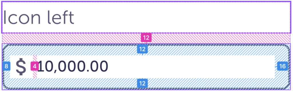
| Default | Hover | Active | Disabled | |
| Background color | – | – | – | $ink-100 |
| Border radius | 8 px | |||
| Border color | $ink-300 | $blue-800 | $ink-800 | $ink-300 |
| Padding | 12 16 12 8 px / 0.75 1 0.75 0.6 rem | |||
| Icon size | 24 px | |||
| Icon color | $ink-600 | |||
| Icon padding-right | 4 px | |||
| Input text size | body-medium-500 | |||
Icon right / Search
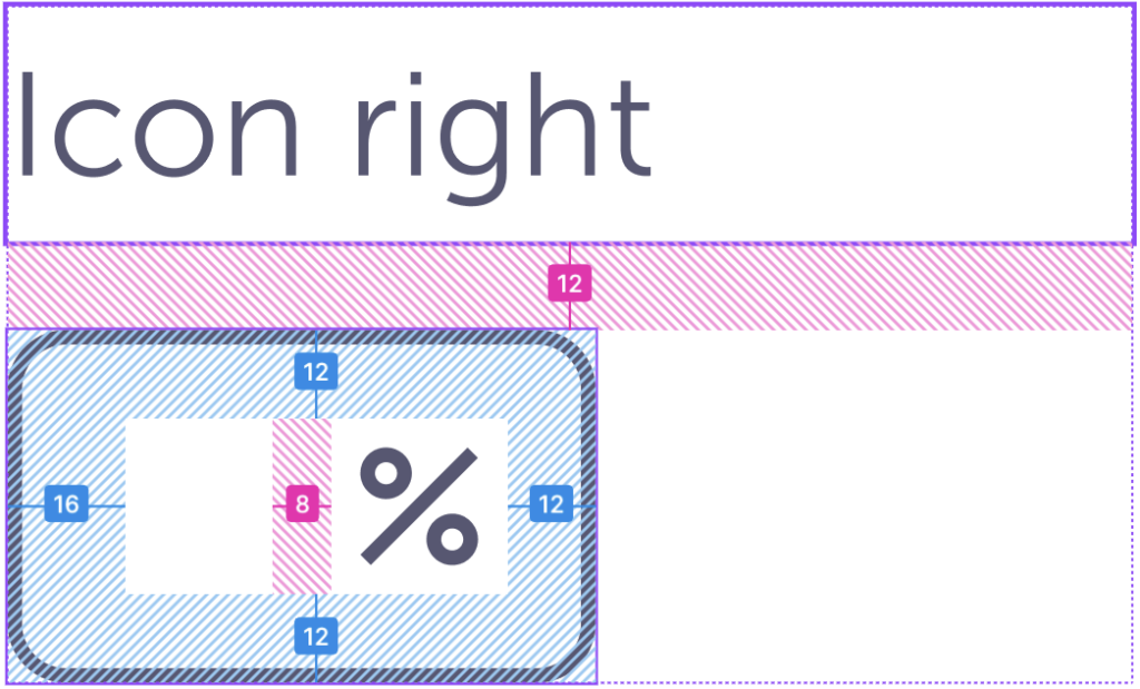
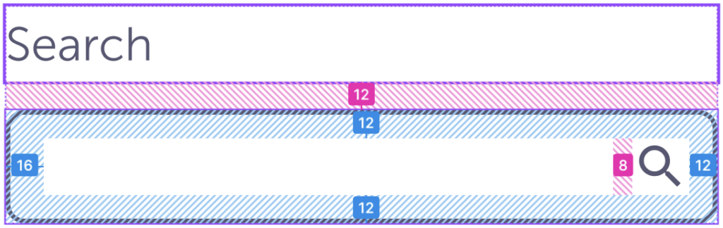
| Default | Hover | Active | Disabled | |
| Background color | – | – | – | $ink-100 |
| Border radius | 8 px / 0.5 rem | |||
| Border color | $ink-300 | $blue-800 | $ink-800 | $ink-300 |
| Padding | 12 12 12 16 px / 0.75 0.75 0.75 1 rem | |||
| Icon size | 24 px / 1.25 rem | |||
| Icon color | $ink-600 | |||
| Icon padding-left | 8 px / 0.5 rem | |||
| Input text size | body-medium-500 | |||
Text area
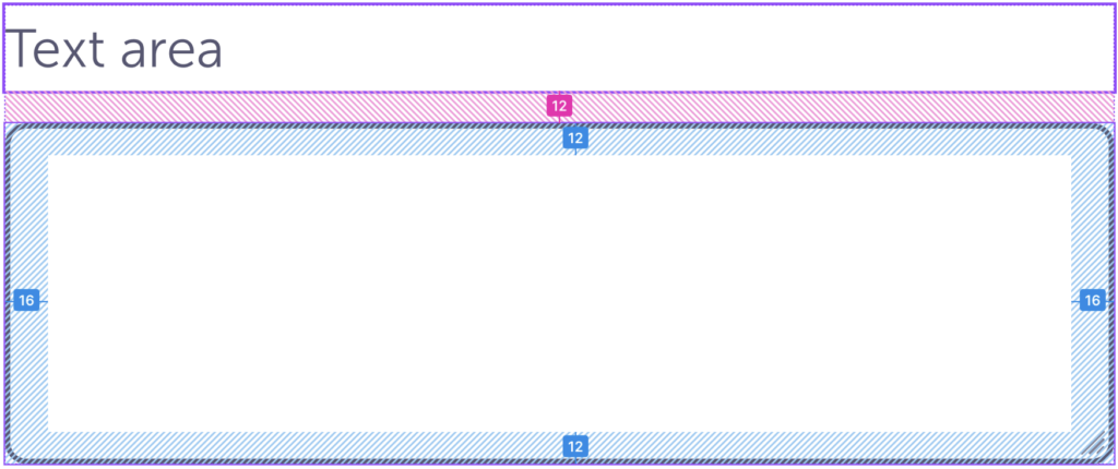
| Default | Hover | Active | Disabled | |
| Min-height | 80px | |||
| Extender icon size | 8 px | |||
| Icon color | $ink-300 | $blue-800 | $ink-800 | $ink-300 |
| Icon placement | 4px away each side, fixed to bottom right | |||
| Background color | – | – | – | $ink-100 |
| Border radius | 8 px / 0.5 rem | |||
| Border color | $ink-600 | $blue-800 | $ink-800 | $ink-300 |
| Padding | 12px 16px / 0.75rem 1 rem | |||
| Input text size | body-medium-500 | |||
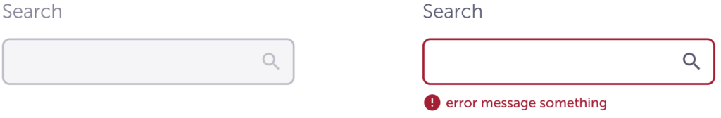
Error message
This can be used with any text input option, the example below only shows the left icon option. Placement is the same for any option.
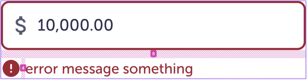
| Border color | $red-600 |
| Input padding-bottom | 8 px / 1 rem |
| Icon color | $red-600 |
| Icon size | 20 px |
| Icon padding-right | 4 px / 0.25 rem |
| Error text size | body-small-500 |
Accessibility
- Can be used with screen readers and without a mouse.
- Color contrast meet AA standards.