Tooltips
Overview
Definition
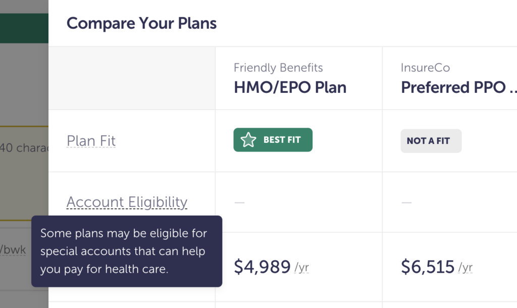
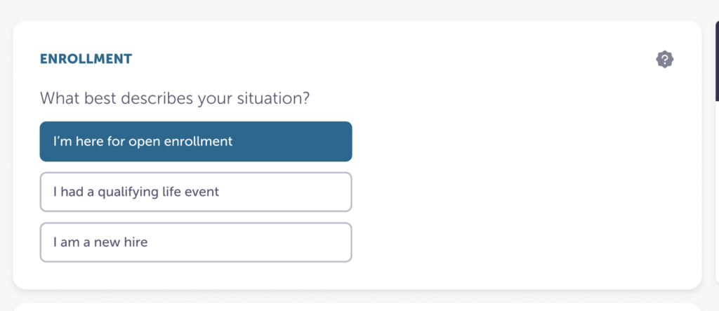
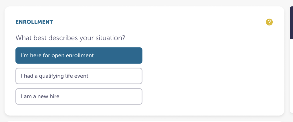
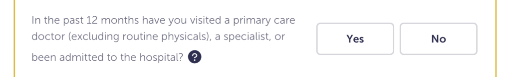
Tooltips are contextual, helpful, and nonessential information that is only visible through interaction.
We have two types:
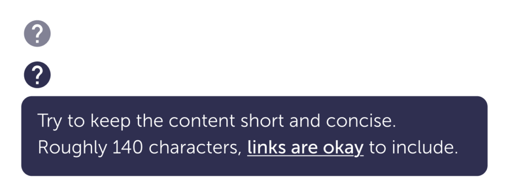
Icon
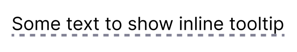
Inline
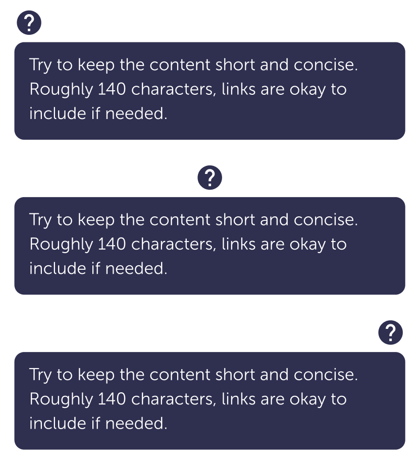
The popover can be justified to:
Left

Center
Right
Similar or related Components
Guidelines
Content
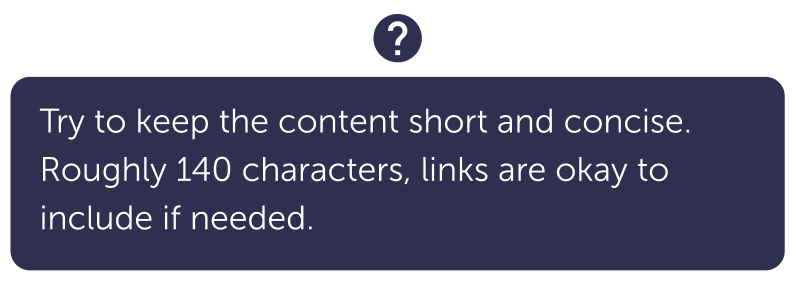
- Try to keep the message in the popover under 140 characters.
- The pop over should not hold essential information. It should provide additional information to help a user complete the task.
- Links are okay to use in the popover.
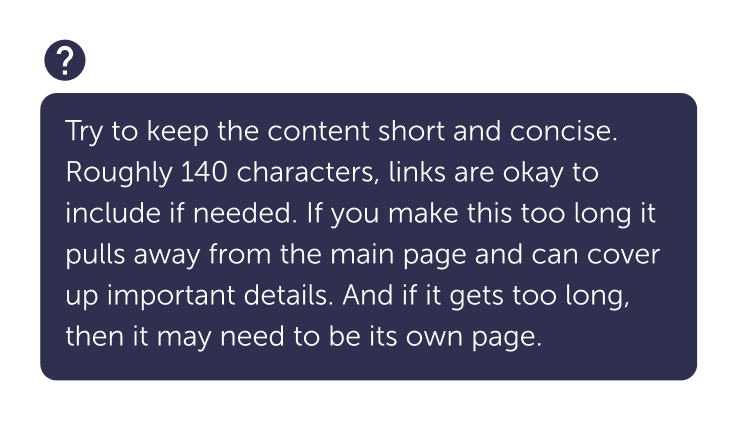
Don’t
Don’t add too much information in the popover.
Visuals
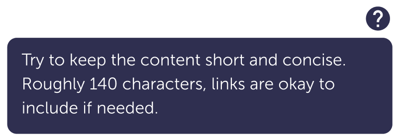
- Be consistent with icon placement—to the right is very common.
- Try not to use too many icons, they can distract from the more important information.
Do
Do use the icon when there is more room.

Do
Use the inline option when an icon isn’t easy or appropriate to use.
For example, when there’s a definition within a paragraph and an icon would change the line height.
Don’t
Don’t change the icon to something else.
Don’t
Don’t change the colors of the icon or popover.
Caution
Try not to use the icon with paragraphs
It creates an odd space between lines of text.
Popover
- The width is set to 320px, the height can change with the content. Don’t change the width unless there is an accessibility reason.
- Can be left, right, or center justified.
Specs
Icon only
| Default | Hover | |
| Icon size | 24 px | |
| Icon color | $ink-400 | $ink-800 |
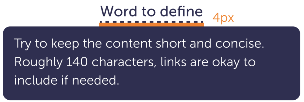
Inline

| Default | Hover | |
| Border width | 2px | |
| Border color | $ink-400 | $ink-800 |
| Dash size | 4 4 | |
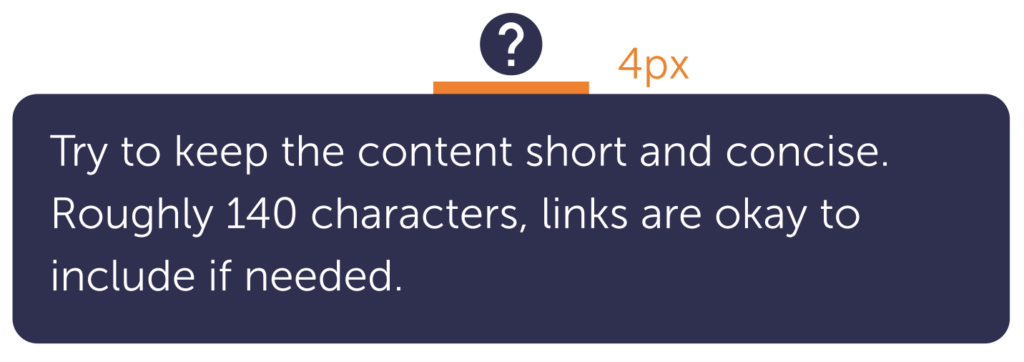
Icon and popover spacing
It’s the same for either option: 4px.
Popover
This can be justified to the center, right, or left of the icon or inline styles.
| Default | |
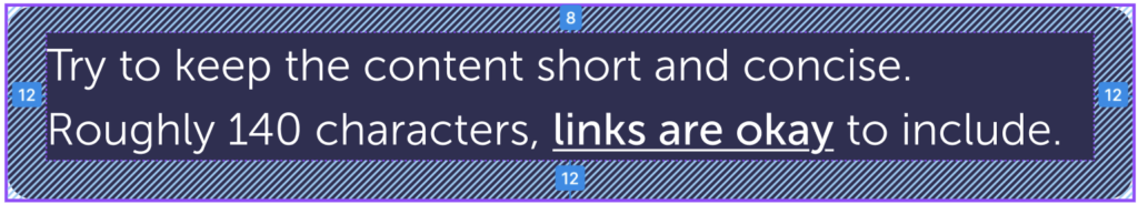
| Margin-top | 4 px |
| Background color | #ink-800 |
| Padding | 8 12 12 12 |
| Text size | body-small-500 |
| Text color | $white |
| Width | 320px |
Accessibility
- Colors pass AA WCAG color contrast.
- Can be used with a keyboard in addition to hover.